Get Indexology® Blog updates via email.

In This List

Green Bond Update for May 2017

The Wind Bloweth Where It Listeth…

100 Days Later in Mexico

Debt Rising

Three Takeaways From the SPIVA U.S. Year-End 2016 Scorecard

Green Bond Update for May 2017

Contributor Image
Dennis Badlyans

Former Associate Director, Global Research & Design

S&P Dow Jones Indices

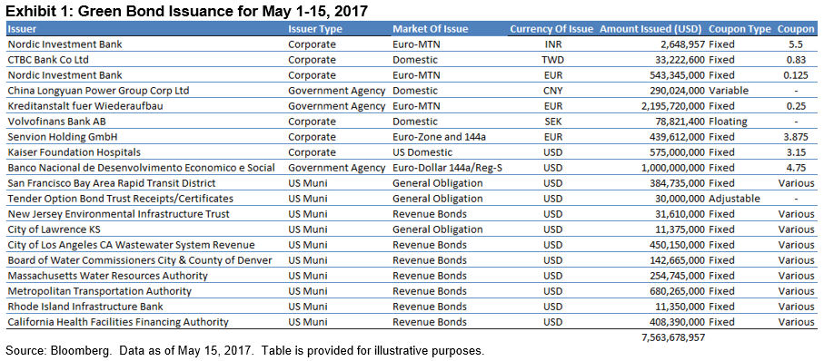
Green bond Issuance picked up in the first two weeks in May compared with the previous two-week period.  Twenty new green labeled bond offerings were announced, including 11 U.S. municipal offerings with maturity structure (215 unique instruments).  Issuance totaled USD 7.56 billion, of which USD 2.4 billion was in U.S. municipal bonds.  Of note, German development bank KFW issued a medium term note (MTN) for EUR 2 billion (USD 2.2 billion) and Brazilian development bank (BNDS) issued a dual registered (144a and Reg-S) bond in the euro-dollar market worth USD 1 billion.

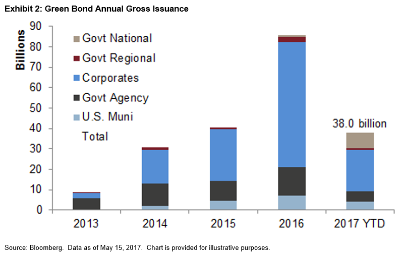
With the exception of January 2017, when France issued its first green treasury bond—which set a new record for size (USD 7.5 billion) in the green bond market—May 2017 is poised to set a new record for issuance.

Total issuance of bonds labeled as green in 2017 is nearing USD 38 billion and is positioned to surpass 2016 issuance, but the pace will need to accelerate for issuance to reach analyst expectations of USD 150 billion.

Related Indices:

S&P Green Bond Index

S&P Green Bond Select Index

Note that not all bonds listed above may be eligible for index inclusion.  Please see the methodology documents for further details.

The posts on this blog are opinions, not advice. Please read our Disclaimers.

The Wind Bloweth Where It Listeth…

Contributor Image
Fei Mei Chan

Former Director, Core Product Management

S&P Dow Jones Indices

In the latest quarterly rebalance (effective at market close on May 19, 2017), the S&P 500 Low Volatility Index added more weight from the technology sector. The jump from 7% to 12% is the largest increase for any sector. Meanwhile, the index continued to shed weight in Consumer Staples and Utilities, historically the stalwarts of Low Volatility.

Notably, this composition also marks the highest weighting in Technology in the history of the S&P 500 Low Volatility Index. Since the index measures the performance of the 100 least volatile stocks in the S&P 500, it has typically had very little, if any, technology exposure.

That Low Volatility had no weight in Technology just a year ago is also noteworthy. The index’s methodology seeks out low volatility at the stock level, but we often look to the S&P 500 sectors as a loose proxy to gather insight.

Continuing their recent trend, all 11 sectors of the S&P 500 declined in volatility as compared to three months ago. The biggest decliners were Energy, Materials, Technology and Consumer Discretionary. And since most things are relative, stocks in Consumer Staples and Utilities had to move aside to make room.

The posts on this blog are opinions, not advice. Please read our Disclaimers.

100 Days Later in Mexico

Contributor Image
Jaime Merino

Former Director, Asset Owners Channel

S&P Dow Jones Indices

100 days…is it a milestone?  Is it a key number?  I’m not sure, but everybody looks like they love to write about it, so I will too.  What I know is in Mexico we have a saying that goes, “If the U.S. sneezes, Mexico gets a cold.”  Following Dennis Badlyans’s post “Does the Outperformance of UDIbonos to MBonos Have Legs?” from January, let’s see how Mexico’s fixed income indices have performed after 100 days with Donald Trump as President of the U.S., as well as how they had performed 100 days before the election when the polls were in the other direction.  Furthermore, how had they performed in the days from the election until he began his presidency?  Eight years ago we were living in different times but, how did the indices perform when Barack Obama began his administration?

First, let’s start by taking a look at Exhibit 1, which shows the overnight reference rate, published by Mexico’s Central Bank (Banxico) and year-over-year inflation over the past 10 years.

We can see for the overnight reference rate that recent rates are at the same levels as eight years ago, but the trend is the other way around from December 2015 until now, as interest rates have risen 350 bps, following or anticipating U.S. Fed movements.  As for inflation, Mexico is hitting the same numbers as it was eight or nine years ago, after closing December 2015 with a historical minimum of 2.13% and closing April 2017 with 5.82%, far from Banxico’s objective of 3%.  One key component to this movement has been the country’s currency—from December 2015 until now, the Mexican peso has depreciated more than 20% (see Exhibit 2).

Exhibit 3 shows that 100 days before the election day in 2016, the Mexican peso gained 3% against the U.S. dollar, which could be attributed to the polls at the time.  On the other hand, 100 days after Trump started his administration, the currency appreciated more than 14%.  However, if we look at the period between Nov. 8, 2016 and Jan., 18, 2017, we can see a depreciation of 10.5%, with a historical EOD close for the Mexican peso on Jan. 10, 2017 of MXN 21.95 per dollar.  For Obama’s administration, in the same three windows, we can see a depreciation of 24% 100 days prior election, almost 9% between election day and the start of his administration, and only a 2% appreciation in his first 100 days.  The most relevant part of inflation for both is in the term of 100 days after, where during the Obama period, inflation came down 7.5% and during Trump’s period, it went up 73%.

With all these movements, Exhibit 4 shows the annualized returns of five of Mexico’s fixed income indices.[1]  It is interesting that for Obama almost every index, in every window, had positive returns except for the S&P/BMV Government International UMS 1+ Year Bond Index 100 days after, where it was down almost 1%, due to an appreciation of the currency.  For Trump, most of the indices have been outperforming except for the 100 days after period, even with the hikes in the interest rates from Banxico.  Exhibit 3 shows the yield for 5- and 10-year nominal bonds went down 30 bps and 54 bps, respectively, but we can see positive returns in the local indices.  Also with Obama, due to the appreciation of the Mexican peso, the UMS index delivered negative returns.

See you at the next milestone.

[1] More information about these indices can be found here: S&P/BMV Government CETES Bond Index, S&P/BMV Government MBONOS 1-5 Year Bond Index, S&P/BMV Government MBONOS 5-10 Year Bond Index, S&P/BMV Government Inflation-Linked UDIBONOS 1+ Year Bond Index, S&P/BMV Government International UMS 1+ Year Bond Index.


The posts on this blog are opinions, not advice. Please read our Disclaimers.

Debt Rising

Contributor Image
David Blitzer

Former Managing Director and Chairman of the Index Committee

S&P Dow Jones Indices

Outstanding household debt reached a new high in the 2017 first quarter, surpassing the level set in the 2008 third quarter when Lehman Brothers failed and the financial crisis arose.

Despite worrisome comments in the press, there is no cause for concern.  First, default rates on mortgages, auto loans and revolving credit are as low or lower than before the financial crisis. Second, the debt service ratio – the proportion of disposable income needed for the average household to service its debts — is 9.98%, close to its all-time low of 9.92%. Third, increases in consumer credit were responsible for setting a new high but mortgage debt is 10% below its 2008 peak.  Add to this the growth in employment and there are no economic reasons for consumer spending to falter. The charts below provide further insight into household debt.

Default rates for mortgages and autos are both low and stable. “Bank cards” are credit cards like VISA, Mastercard or private label credit cards. These are revolving credit where an outstanding balance can be paid off at any time instead of a fixed payment schedule. The bank card default pattern is less stable and might be creeping up.  The Federal Reserve’s recent survey of Senior Bank Lending Officers revealed that a small portion of banks were tightening credit standards for consumer borrowing.

The second chart shows consumer credit outstanding for both revolving and non-revolving loans. Non-revolving loans include auto loans and are larger than revolving credit. They were less affected by the financial crisis.  The green line is total consumer credit (revolving and non-revolving) as a percentage of personal income. This shows that the use of consumer credit expanded substantially after about 1996, leveled off between 2004 and 2008 and then recovered and continued to rise after the financial crisis. Whether attitudes about using credit shifted or wage gains had difficulty keeping up with spending isn’t clear from these data.

Student loan growth is significantly higher than other segments of consumer credit. In the last ten years, student loan debt grew at a 10% annual rate compared auto loan growth of 4.4% annually and little net gain in revolving credit.

Total mortgage debt for one to four-family homes is rising again and housing is recovering as shown by the red line. More interesting is the blue line which shows that household mortgage debt as a proportion of personal income peaked at over 90% then fell sharply as mortgages were paid off or written off as the economy expanded after the 2007-9 recession ended. Since mortgage debt was one of the problems leading the economy into the financial crisis, this suggests that there may be a cushion should another downturn loom up in the near future.

Debt tends to have a bad reputation in both history and literature. In economics it is worth noting that without debt and borrowing we wouldn’t have a capitalist economy or financial markets.

The posts on this blog are opinions, not advice. Please read our Disclaimers.

Three Takeaways From the SPIVA U.S. Year-End 2016 Scorecard

Contributor Image
Ryan Poirier

Former Senior Analyst, Global Research & Design

S&P Dow Jones Indices

S&P Dow Jones has been reporting the SPIVA® U.S. Scorecard for 15 years now.  Over the years, it has helped contribute to the active versus passive debate in a systematic and objective manner.  While some market segments or styles of active management can be cyclical in their ability to outperform, the secular trends in reported long-term SPIVA numbers remain fairly consistent.  Beginning with the year-end 2016 report, we have a 15-year comparison, which captures a full market cycle.

There are three key observations we can make from the SPIVA U.S. Year-End 2016 Scorecard: (1) the majority of active managers across major equity and fixed income categories, on average, underperformed their benchmarks over the medium- to long-term horizon, (2) the secular bull market since the 2008 financial crisis has been a difficult hurdle for managers to overcome, and (3) most domestic equity managers failed to navigate effectively during volatile periods in the marketplace (one-year period).

Exhibit 1 addresses the first observation for the various asset classes reported in SPIVA.  The scorecard shows that 92.15% of large-cap, 95.40% of mid-cap, and 93.21% of small-cap Funds underperformed their benchmarks, respectively.  This lag in performance is a result of approximately 50% of funds surviving the whole period.  Market participants seek managers that will outperform, but simply having a fund that will survive may be the first checkpoint.

It has also proven difficult for active managers to outperform passive indices during the secular (eight-year) bull market.  U.S. equity managers fared marginally better on a percentage basis over the five-year period; nevertheless, the majority of managers still underperformed the benchmark (see Exhibit 1).  Exhibit 2 shows the yearly performance of the S&P 500 on a total return basis.  Wrong security selection, insufficient market beta exposure, or having a large allocation to cash could possibly result in underperformance, given the strength of the market.

One proposed benefit of active management is that managers have the ability to make tactical asset allocation decisions depending on the market environment, while passive indices cannot do so, as they tend to be structurally constrained by an index rebalancing schedule as laid out in the methodology.  The past one-year period encapsulated three market events that could have been the catalyst for such a tactical strategy: China’s economic concerns (Q1), Brexit (Q2), and perhaps a “risk off” environment in anticipation for an uncertain election result (Q4).  Exhibit 3 shows the performance of the S&P 500 along with the drawdowns from previous highs for each event.  Even amid these market events, 66% of large-cap, 89.37% of mid-cap, and 85.54% of small-cap fund managers underperformed (see Exhibit 4).

The SPIVA Scorecard can act as the starting point for market participants to understand more about the effectiveness of passive investing across major core equity and fixed income categories.  The year-end 2016 report in particular is noteworthy in that it addresses key areas of active management: long-term performance, the impact of secular bull markets on managers’ performance, and managers’ ability to navigate market volatility.

Based on the SPIVA findings, core passive indices can potentially be used in the investment process and portfolio construction.  To learn more about passively implemented core asset allocation strategies, please join us for our webinar In With the Old and the New: Why Core Strategies Are Still Essential.

The posts on this blog are opinions, not advice. Please read our Disclaimers.