Get Indexology® Blog updates via email.

In This List

In Which Market Cycles Do Active Funds Add the Most Alpha?

How to Build a TIPS Ladder Portfolio for Millennials

Active Fund Management in South Africa Continued to Struggle in 2016

How Much Is Your Social Security Benefit Worth?

Alaska Healthcare Profiled

In Which Market Cycles Do Active Funds Add the Most Alpha?

Contributor Image
Akash Jain

Director, Global Research & Design

S&P BSE Indices

Those who invest in active funds may expect portfolio managers to deliver excess returns over their benchmark indices for the fee they paid.  However, results from the SPIVA® (S&P Indices Versus Active) India Scorecard suggest this may not always be the case.  The scorecard, which is a biannual report, attempts to capture the performance of active funds (both equity and debt funds) domiciled in India against S&P BSE benchmarks over different time horizons.

In our extended study of Indian Equity Large-Cap and Indian Equity Mid-/Small-Cap fund performance, we found that fund managers did not deliver persistent outperformance across market cycles.  We divided the ten-year period ending December 2016 into three market regimes, including bear (peak to trough), recovery (first 12 months after the trough), and bull phase (from recovery to the peak), based on the S&P BSE Sensex total return performance, and examined performance of the Indian Equity Large-Cap and Indian Equity Mid-/Small-Cap funds in different markets (see Exhibit 1).  We also compared asset-weighted and equal-weighted excess returns versus the benchmarks for these two categories, in order to understand how the larger funds (by assets under management) performed against their peers.

Exhibit 1: Illustrative Market Cycles
MARKET CYCLE PHASE PERIOD
Bear Market Periods December 2007-February 2009
December 2010-December 2011
February 2015-February 2016
Bull Market Periods December 2006-December 2007
February 2010-December 2010
December 2012-February 2015
Recovery Periods February 2009-February 2010
December 2011-December 2012
February 2016-December 2016

Source: S&P Dow Jones Indices LLC.  Data from December 2006 to December 2016.  Table is provided for illustrative purposes.

We observed that the fund returns in these two categories had relatively low beta across different market cycles, which may have been driven by allocation to cash or defensive/low beta stocks in their portfolios.  As a result, the active funds tended to outperform by a more significant margin in bear markets and by a relatively modest margin in bull markets.  This also indicates that the alpha generation by fund managers’ stock selection was more limited during bull markets, which may not be expected.

Exhibit 2: Beta and Active Fund Average Excess Return in Bull, Bear, and Recovery Markets
MARKET CYCLE INDIAN EQUITY LARGE-CAP INDIAN EQUITY MID-/SMALL-CAP
BETA
Bull 0.95 0.84
Bear 0.89 0.82
Recovery 0.89 0.79
EXCESS RETURNS VERSUS BENCHMARK (EQUAL-WEIGHTED, ANNUALIZED, %)
Bull 0.0 2.0
Bear 0.4 6.7
Recovery -3.0 -6.3
EXCESS RETURNS VERSUS BENCHMARK (ASSET-WEIGHTED, ANNUALIZED, %)
Bull -0.2 2.3
Bear 0.8 8.4
Recovery -1.6 -5.9

Source: S&P Dow Jones Indices LLC.  Benchmark for Indian Equity Large Cap is S&P BSE 100 and for Indian Equity Mid/Small Cap is S&P BSE MidCap.  Beta calculated using Asset-Weighted Fund Returns.  Data from December 2006, to December 2016 based on SPIVA India Year-End 2016 Scorecard.  Past performance is no guarantee of future results.  Table is provided for illustrative purposes.

Furthermore, active funds outperformed in trend-continuation markets and underperformed when the market regime changed, as active funds underperformed their benchmark indices by large margins and their return betas versus their benchmark remained low during recovery phases.  This implied that most fund managers may not have reduced their cash positions or tilted their portfolios to less defensive stocks when the market recovered from market downturns.

Indian Equity Large-Cap and Indian Equity Mid-/Small-Cap funds did not deliver persistent outperformance across different markets; they underperformed or had limited outperformance versus their benchmark for the 10-year period, as reported in our latest SPIVA India Scorecard.  It is also clear that larger funds in these two categories tended to perform better than smaller funds across different market cycles.

To discover more about the performance of Indian active funds versus their benchmarks, check out the SPIVA India Year-End 2016 Scorecard.

Exhibit 3: Outperformance of Indian Large-Cap Funds Versus the S&P BSE 100

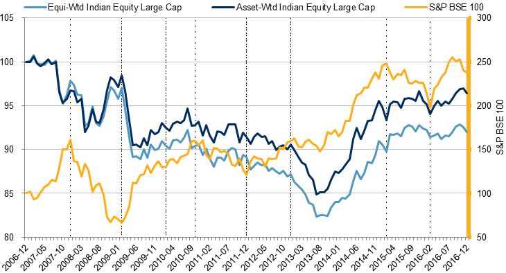
Source: S&P Dow Jones Indices LLC.  Data from December 2006 to December 2016 based on SPIVA India Year-End 2016 Scorecard.  Past performance is no guarantee of future results.  Chart is provided for illustrative purposes.

Exhibit 4: Outperformance of Indian Mid-/Small-Cap Funds Versus the S&P BSE Midcap

Source: S&P Dow Jones Indices LLC.  Data from December 2006, to December 2016 based on SPIVA India Year-End 2016 Scorecard.  Past performance is no guarantee of future results.  Chart is provided for illustrative purposes and reflects hypothetical historical performance.  The S&P BSE Midcap was launched on April 15, 2015.

The posts on this blog are opinions, not advice. Please read our Disclaimers.

How to Build a TIPS Ladder Portfolio for Millennials

Contributor Image
Peter Tsui

Former Director, Global Research & Design

S&P Dow Jones Indices

In his January blog post entitled “Try a TIPS Mixer in Your Equities Cocktail,” Phillip Murphy described the potential benefits of including Treasury Inflation-Protected Securities (TIPS) in one’s portfolio.  In this blog aimed at Millennials, I would like to propose an easy way to build up a 30-year TIPS portfolio for retirement.

Let us assume that Alice, age 25, wants to create her own do-it-yourself TIPS portfolio to be one of her sources of retirement income when she turns 65, 40 years hence.  Without a lot of investment decision-making experience, what would be an affordable way for Alice to accomplish her goal?

To begin with, it may help for Alice to read “Risk Less and Prosper: Your Guide to Safer Investing,” by Zvi Bodie and Rachelle Taqqu, in which the authors argue for accumulating TIPS in one’s portfolio, because TIPS provide inflation protection and hedge against interest rate risk.  In addition, if the TIPS securities were held to maturity, as would be the case for a laddered portfolio, then there shouldn’t be any risk.

Currently, if Alice has a TreasuryDirect account, she can participate in non-competitive biddings throughout the year.  Some key facts about TIPS are as follows:

  1. TIPS are issued in terms of 5, 10, and 30 years;
  2. The interest rate on a TIPS is determined at auction,
  3. TIPS are sold in increments of USD 100, with the minimum purchase at USD 100;
  4. TIPS are issued in electronic form; and
  5. TIPS can be held until they mature or, if desired, they can be sold in the secondary market before they mature.

For more details, please visit the TreasuryDirect website at: https://www.treasurydirect.gov/indiv/research/indepth/tips/res_tips.htm.

As described by Wikipedia: “TreasuryDirect is a website run by the Bureau of the Fiscal Service under the United States Department of the Treasury that allows U.S. individual investors to purchase Treasury securities such as T-Bills, TIPS, and others directly from the U.S. government.  Its website allows money to be deposited from and withdrawn to personal bank accounts, and allows rolling repurchase of securities as the currently held items mature.”

Thus, for Alice, her TreasuryDirect account would be a cost-effective investment account to accumulate TIPS.  From age 25 to 34, at a relatively modest salary, Alice would buy the 10-year TIPS, at USD 5,000 a year.  From age 35 to 44, as her compensation grew, she would roll over the maturing 10-year TIPS into 30-year TIPS each year, and she would buy an additional USD 5,000 of the 30-year TIPS.  From age 45 to 54, she would buy USD 10,000 each year of the 30-year TIPS.  Finally, from age 55 to 64, she would buy USD 10,000 each year of the 30-year TIPS.  As she turns 65, she would have built up a 30-year laddered TIPS portfolio, with USD 10,000 of TIPS securities maturing in each of the next 30 years.  Since these TIPS securities have coupons and inflation-adjusted principal amounts, the nominal amounts would be much different from the face amount of USD 10,000; but in real terms, meaning on an inflation-adjusted basis, each maturing tranche of the laddered portfolio would provide the same purchasing power of a real USD 10,000.

For Alice, having a 30-year TIPS laddered portfolio of USD 10,000 real income each year would be a nice supplement to her other sources of income from Social Security benefits and defined-contribution retirement savings.  If, along the way to her retirement, she could afford to buy more TIPS, then her TIPS nest-egg could be correspondingly larger.

It may not seem like a big deal to have such a USD 10,000 30-year TIPS laddered portfolio available for retirement income when one is ready to retire.  However, bear in mind that the maximum social security benefits one may get (in current U.S. dollars) is around USD 2,800 per month, or USD 32,600 a year.  In this context, an income of USD 10,000 a year would increase one’s social security income by about one-third.

The posts on this blog are opinions, not advice. Please read our Disclaimers.

Active Fund Management in South Africa Continued to Struggle in 2016

Contributor Image
Daniel Ung

Former Director

Global Research & Design

Equity markets in South Africa, as measured by the S&P South Africa Domestic Shareholder Weighted (DSW) Index ZAR, increase 5% in 2016.  Aside from the GDP contraction experienced in the last quarter of 2016, conditions were generally improving in the country.  For example, the South African rand strengthened during the year and the municipal elections passed without incident.

However, it appears that active managers were not able to take advantage of these more favorable conditions; 72% of South African equity funds underperformed their corresponding S&P DJI benchmark over the one-year period, and 77% underperformed over the 10-year period.

In regard to active funds invested in global markets, funds in South Africa fared poorly during the year and were the worst performers among the fund categories studied in the SPIVA® South Africa Year-End 2016 Scorecard.

For more details of the report, please click here.

The posts on this blog are opinions, not advice. Please read our Disclaimers.

How Much Is Your Social Security Benefit Worth?

Contributor Image
Peter Tsui

Former Director, Global Research & Design

S&P Dow Jones Indices

Social Security benefits are the gold standard of retirement income.  As Nobel Laureate Robert Merton commented in his article “The Crisis in Retirement Planning,” published in the Harvard Business Review (July/August 2014): “Ask someone what her pension is worth and she will reply with an income figure: ‘two-thirds of my final salary,’ for example.  Similarly, we define Social Security benefits in terms of income.”  In this blog, I will turn it around and try to put a price tag on this stream of retirement income.

This may be timely, as anyone who has read their Social Security statement lately might agree.  As of March 2017, the Social Security Administration includes the following message in the statement received by current and prospective social security benefit recipients: “Your estimated benefits are based on current law.  Congress has made changes to the law in the past and can do so at any time.  The law governing benefit amounts may change because, by 2034, the payroll taxes collected will be enough to pay only about 79 percent of scheduled benefits.”

If we wanted to provide for ourselves the potential shortfall of 21% in our social security benefits in 2034, how much would it cost us?

To answer this question, we consider that the current cost of a single life income annuity paying USD 1,000 per month is around USD 185,000.  Since social security benefits are adjusted for inflation, the cost of such a single life income annuity would be higher.  Without knowing the pattern of inflation changes over time, most annuity providers assume a 2% annual increase in monthly incomes.  With a 2% annual increase option, the current cost of this single life income annuity is about 23% higher, at USD 227,300.

The next step is to determine the monthly social security benefits one would receive.  Assuming the retiree is currently receiving USD 2,500 per month, the projected 21% reduction by 2034 would mean roughly USD 500 less per month.  Thus, since we know it would cost the retiree USD 227,300 to get USD 1,000 per month for life with a 2% annual increase, in order to replace USD 500 a month, the retiree would need to come up with one-half of USD 227,300, or USD 113,650, to get back up to the USD 2,500 monthly income, in current U.S. dollars.

Looking at this another way, if securing USD 1,000 per month costs USD 227,300 now, that means the value of the USD 2,500 monthly income in social security benefits would be worth about USD 568,255 in current U.S. dollars.

The posts on this blog are opinions, not advice. Please read our Disclaimers.

Alaska Healthcare Profiled

Contributor Image
Glenn Doody

Vice President, Product Management, Technology Innovation and Specialty Products

S&P Dow Jones Indices

According to an April 6, 2017, CNN story titled “High-cost Alaska sits in the eye of health care reform storm,” Alaska currently has the highest healthcare costs of any U.S. state.[1]  In this first profile edition, we look at the state of Alaska and compare just how different the cost profile is for people living in the far North.

To start, we look at the state on a per member per month (PMPM) basis.  As seen in Exhibit 1 and described in the CNN story, healthcare costs are significantly higher in Alaska than any other state in the U.S.  In fact, on average, each Alaska resident spends about USD 525 per month on healthcare as of October 2016, versus a cost of just USD 366 nationally—a USD 160 a month difference, or 43% more.  One could argue that the Affordable Care Act (ACA) is a major reason for this huge cost difference.  However, as Exhibit 1 illustrates, this difference has existed long before the introduction of the ACA.

There Is Hope

There is hope for those in Alaska.  Between August 2015 and October 2016, the increase in healthcare cost trends across the state declined rapidly (see Exhibit 2).  This decline was much more rapid than elsewhere in the country.  In fact, during that same period, change in cost trends in the state of New York continued to increase, peaking at a rate of over 8%.  Even the national trend, which dropped from a high of 5.51% to 4.40%, was not close to the decline in cost increases from 8.84% to 1.71% that we saw in Alaska.  Since October 2014, Alaska has been trending flat.  The average PMPM cost in Alaska between October 2014 and October 2016 was just USD 550, with costs starting at USD 577 per month and ending at USD 525 per month.

[1] “High-cost Alaska sits in the eye of health care reform storm.”

The posts on this blog are opinions, not advice. Please read our Disclaimers.