Get Indexology® Blog updates via email.

In This List

Risk and Active Management

Flying ETFs...a tenuous link

An Unusual Thing Happened In August: Only Energy Rose

What’s Next from the Fed

A Closer Look at Payout Ratios and Earnings

Risk and Active Management

Contributor Image
Tim Edwards

Managing Director, Index Investment Strategy

S&P Dow Jones Indices

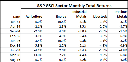
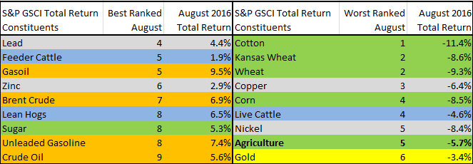
Regular readers of this blog will be familiar with industry-wide comparisons made between the returns of active funds and their passive equivalents.  Studies comparing the risk of active funds are rarer, but have the potential to provide actionable insights:  at the very least, examinations of fund risk can help to evaluate the a claim that active funds offer superior risk management to passive alternatives.

A recent examination of the risk profiles of active funds provides support for several interesting conclusions:

  • Within a given fund category, the most volatile active funds are likely to remain more volatile than their peers, and the least volatile funds similarly.  So while, as the saying goes, a fund’s historical returns offers “no guide to future performance”: past volatility may provide a useful indication of future volatility in active funds.
  • U.S. large-cap funds with consistently high volatility appear to generate that volatility through holdings of high-beta stocks; funds with the lowest volatility get there through significant cash allocations.
  • There is no obvious relationship between a fund’s category risk and return ranking – additional risk in funds does not appear to have been rewarded.
  • We found categories and time periods where funds did, on average, reduce risk, but the evidence suggests that fund managers do not provide risk reduction in the aggregate.

Our paper suggests several important conclusions for active fund managers and their investors. First, a higher risk fund should not be expected to offer a higher return.  Second, the relative risk profile of a fund may be sensibly evaluated with reference to history.   And finally, given that the outperformance of low-beta and low-volatility stocks may be a persistent phenomenon, the active fund industry might be missing a simple trick to improve the performance of defensive managers: allocations to less volatile stocks may be a better way to reduce risk than simply moving to cash.

The posts on this blog are opinions, not advice. Please read our Disclaimers.

Flying ETFs...a tenuous link

Contributor Image
John Davies

Former Managing Director, Global Head of Exchange Traded Products

S&P Dow Jones Indices

The month of August fills me full of joy every year as (a) it’s my birthday, (b) it’s the Summer in London (at least 1 week of Sun!) and (c) I don’t get on a plane to support our many ETF partners around the world.

Aeronautically speaking though, August is a notable month – way back in August 1783 we had the 1st hydrogen-filled balloon flight. Almost 150yrs later, August 1929 saw the 1st round the world airship flight by the Graf Zeppelin. After becoming the 1st woman to complete a solo transatlantic flight in May 1932, August 1932 saw Amelia Earhart also become the 1st woman to complete a flight across the US non-stop.

Now here comes the tenuous link – Amelia made her historic US flight in 1932 on August 24th, in 1937 in her fateful last attempt to circumnavigate the globe, the last continent Amelia took off from was Australia…..roll the clock forward to August 24th, 2001 and we witnessed the take-off of the Australian ETF market with the inception of the SPDR® S&P®/ASX 200 Fund, more commonly known by its’ ticker, STW.

If you think that’s a stretch, how about this – Amelia Earhart was heading towards Howland Island in the Central Pacific Ocean when she disappeared. Howland Island lies almost halfway between Australia and Hawaii and is an unincorporated unorganized territory of the United States………which is where the most commonly accepted 1st ETF, as we know them today, was launched, the SPDR® S&P 500® ETF, otherwise known as SPY.

STW is 15yrs old and is just over US$2.2bn which makes it roughly 16% of the US$14bn total Aussie ETF market. When SPY was the same age, it was around US$70bn and it made up approximately 10% of the then US$700bn US ET market. SPY is now 23yrs old and has SPY has recently touched US$200bn making it still ~10% of the US ETF market. However, more interesting is the fact that whilst SPY’s relative weight hasn’t changed, the market has trebled in size and SPY has grown along with it.

Now, if you look at the Aussie ETF market, it took nearly 11yrs for the 1st US$6bn to be raised but only a further 2yrs for it to double to US$12bn back in 2014 and is already up to US$14bn as at the end of Jul’16. Furthermore, the 10yr CAGR for the Aussie ETF market is 40.1% which is almost double that of the US figure of 21.2%.

Therefore, with the implementation of FOFA and the further embracing of ETFs by FA’s, Supers and Retail investors alike, one could argue that this is just the beginning for the ETF market in Australia – after all, it has been a 23yr Global “overnight success”.

Caveat Emptor – in the spirit of balance, August 24th 2015 was not a good day for the US ETF market (plenty of articles out there on this event) but the assets under management have increased by just over 10% a year later.

The posts on this blog are opinions, not advice. Please read our Disclaimers.

An Unusual Thing Happened In August: Only Energy Rose

Contributor Image
Jodie Gunzberg

Former Managing Director, Head of U.S. Equities

S&P Dow Jones Indices

For the first time since March 2008, energy was the only positive sector in the S&P GSCI for the month in Aug.  Energy gained 6.2%, while agriculture, industrial metals, livestock and precious metals lost 5.7%, 3.2%, 0.4% and -4.0%, respectively.  Not only is this the first month in over 8 years for energy to rise alone, but it has only happened 9 times since energy entered the index in Jan. 1983.

Source: S&P Dow Jones Indices

Historically, when energy rises, other sectors rise.  In 75% of the time, at least two other sectors rise, and on average gain 93 basis points. The sector performance, especially energy, has great influence on the overall returns of indices with different weights like the S&P GSCI that is world production weighted and the equally weighted Dow Jones Commodity Index (DJCI).  For example, it made the difference between being positive or negative for the month with the S&P GSCI gaining 1.8% and the DJCI losing 1.7% in August.

Although energy was the only positive sector, the individual commodity performance was dispersed. Almost half (11/24) were positive with at least two positive commodities from each sector, except precious metals that only includes gold and silver.  Gasoil gained 9.5% in Aug. and was the best performer while the worst performer was cotton that lost 11.4%, breaking a new record for its worst August ever with data since Jan. 1977.  That was in-line with most of the agriculture sector that was down, posting its 5th worst August ever. However, there was dispersion even inside the agricultural bloodbath, like from sugar. It gained 5.3% in Aug., that was its 8th best August in history from 1973. and its best 12-months in 5 years, up 71.6%.

Source: S&P Dow Jones Indices

The split performance shows how the fundamentals impact individual commodities and sectors separately. For example, while it seems oil is having major ups and downs, its volatility is only just over 35% that is slightly above its long-term average. In reality oil’s 90-day volatility has dropped from almost 60% in April to under 40% now, and is less than half its peak from the global financial crisis. Its moves are more controlled now and reflecting its fundamentals. Crude oil has had a total return of almost 40% since January when the suppliers have started to adjust. Since there are issues with OPEC’s ability to control the supply, the key for recovery is lower US inventories.  Volatility has also been about 1/3 less this year for metals and agriculture than in their 10-year histories.

Industrial metal commodity returns have had a big divide too. Copper lost 6.4% in August, driving it down 1.9% for the year while zinc is up another 2.9% for the month bringing its year-to-date gains to 42.6%. Zinc is now on pace to post its 3rd best year ever, only behind 2006 and 2009, using data from 1991. There have been supply cuts of zinc that may not be reversed until the companies feel they can produce again at sustainably higher prices. A similar story is true even for aluminum that is generally so abundant. However, the industrial metals as a sector are most sensitive to a weaker US dollar so if the dollar falls, that could be a big positive for the metals.

The Agriculture sector has been reacting as per its individual acreage and crop numbers. Its pricing is dependent mainly on the weather impacts and the commercial processor demand. For example, heavy rain has slowed sugar output, that has boosted prices; whereas cocoa prices increased from a drought.

Our 10th Annual Commodities Seminar takes place in London on 29th September. Additional information and registration are available online now. #SPDJICommods

The posts on this blog are opinions, not advice. Please read our Disclaimers.

What’s Next from the Fed

Contributor Image
David Blitzer

Former Managing Director and Chairman of the Index Committee

S&P Dow Jones Indices

Last weekend the Federal Reserve held its annual symposium at Jackson Hole Wyoming and discussed near and longer term monetary issues.

No Rate hike in September

There are three FOMC meetings remaining this year: September 21st, November 2nd and December 14th. While there is no rule that all interest rate target changes must come at FOMC meetings, the focus is on the September and December meetings.  The November session is less than a week before the election so most believe that the (more or less) apolitical central bank will avoid November.  Given comments during and since the Fed’s annual August Jackson Hole meeting last weekend, a rate increase before the end of the year is a good bet.  With unemployment at 5% and inflation seeming to approach 2% from below, the central bank is comfortable with an increase in interest rates.  The choice between September and December depends on how the upcoming data look.  The first and most important number will be Friday’s report on employment.  Lately the monthly increase in jobs has been around 190,000; it will take a figure substantially higher than that to get a rate increase in September.  More likely, the central bank will wait until December when there will be a longer track record on employment and a strong GDP figure for the third quarter. If last December’s rate increase and one this year are seen as a new tightening cycle, it will be both slow and weak compared to history as seen in the chart.

No More Unconventional Policy

Past quantitative easing inflated the Fed’s balance sheet and made traditional open market operations ineffective for setting interest rates. In response the Fed now pays interest on excess reserves banks hold at the Fed and uses reverse re-purchase agreements to adjust the fed funds rate target.  In her speech at the Jackson Hole symposium, Fed Chair Janet Yellen said the current process is working.  She also expressed confidence that the Fed will be well positioned to deal with a future downturn in the economy given the current policy tools including interest rate management, quantitative easing and forward guidance. Any discussion of negative interest rates was notably absent from her remarks. The second chart shows the recent evolution of the balance sheet.

Fed Balance Sheet

Sometime in the (more distant) future, the Fed is likely to begin efforts to shrink the size of its balance sheet. However, an early return to old fashioned open market operations is probably far off.

Some Unconventional Thinking

Conventional thought believes the Fed handles monetary policy, sets interest rates and attempts to control the inflation rate while the Treasury acting for the federal government is responsible for taxes, spending and the budget deficit (or surplus if one occurs).  At the Jackson Hole sessions Professor Christopher Sims of Princeton University argued that this division of labor doesn’t always work.  The central bank’s ability to control the money supply is limited by how many bonds it can buy or sell; and the number of bonds is determined by the treasury.  Higher interest rates raise spending by the Treasury, lead to either greater bond issuance or changes in taxes. However, if no one wants to buy the bonds, the central bank is expected to step up and be the buyer of last resort to finance the government deficit.

One message is that both monetary and fiscal policies are necessary for successful economic policy; however together they may not be sufficient.

The posts on this blog are opinions, not advice. Please read our Disclaimers.

A Closer Look at Payout Ratios and Earnings

Contributor Image
Erik Norland

Executive Director and Senior Economist

CME Group

Beyond the growth in nominal GDP, the other two macro-factors that may influence the returns of the S&P 500® Dividends Index: payout ratios and corporate earnings.

When corporations make profits, they have a choice: They can either reward shareholders or they can retain and reinvest the earnings.  While some companies, notably fast-growing technology firms, opt to retain all of their earnings, most choose to pay out a portion in dividends.  These dividend payout ratios fluctuate over time, though not necessarily with a strong correlation to the economic cycle.  Payout ratios rose during the 1980s boom but declined during the period of strong growth during the 1990s.  They also fell substantially during the 2008 recession, but rose during the most recent expansion. Dividend payout ratios can also fluctuate in response to changes in tax policy. Over the past few decades, payout ratios have averaged to around 40-50%.

Corporate Earnings
Corporate earnings rarely exceed 10% of GDP. They reached this level briefly in 2006 and hovered around 10% from 2011 to 2014.  They have since dropped to around 8.5% because the labor market has tightened, wages have begun to rise while productivity growth has remained slow.  All of these factors are putting downward pressure on corporate profits.  The impact of declining corporate profits on dividends has been offset by two other factors:

  1. Continued growth in nominal GDP, which has been growing at around 3.5% year on year.
  2. A rising dividend payout ratio, which now exceeds 50% of earnings.

Notably, when corporate earnings peak as a percentage of GDP and begin to decline, equity prices can continue to rise. During the 1990s, earnings peaked as a percentage of GDP in 1997 while stocks continued to rise until 2000.  During the subsequent decade, earnings peaked relative to GDP in 2006 but stocks didn’t reach their highest levels until late 2007.  Likewise, this time around, earnings as a percentage of GDP may have plateaued in 2011-14 and then began falling, but the S&P 500® continued upward and broke to a new record high (Figure 1).  As such, a peak in earnings doesn’t necessarily imply an imminent peak in equity prices.  That said, post-peak earnings declines often correlate with periods of rising equity volatility (Figure 2).

Capture

Capture

The posts on this blog are opinions, not advice. Please read our Disclaimers.