Get Indexology® Blog updates via email.

In This List

Rieger Report: Bond Market Malformation Worsens

Credit Cards and Retail Sales

The Usual Suspects

The Consequences of Concentration: 1 - More Risk

Remember Inflation

Rieger Report: Bond Market Malformation Worsens

Contributor Image
J.R. Rieger

Former Head of Fixed Income Indices

S&P Dow Jones Indices

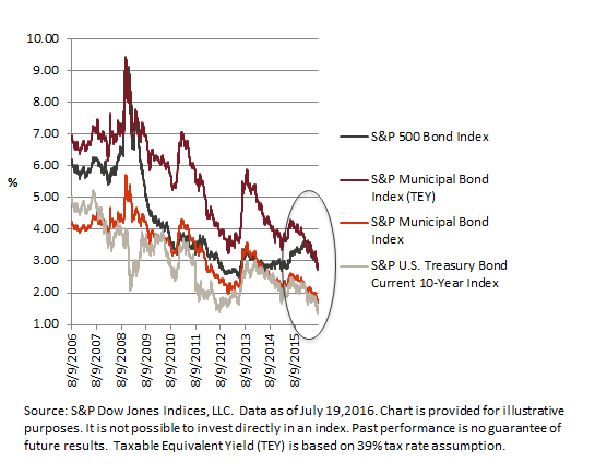
As we approach August, the U.S. bond markets have extended their malformed shape despite another round of chatter about the possibility of a Fed hike, this time towards year end.  Subsequent to the June 2nd, 2016 blog Bond Market Malformation, Trouble Ahead? bond yields have compressed further.

Demand continues to outstrip the supply of U.S. investment grade corporate and municipal bond issues as investors seek incremental yield over Treasuries and safe harbors (risk off) during volatile periods. The result bond prices have continued to rise and yields have fallen.

  • Record low municipal yields: The weighted average yield of bonds in the S&P Municipal Bond Index hit a low point not seen before in its 15 year life as the yield to worst (YTW) reached a low point on July 8th of 1.687%.
  • The Taxable Equivalent Yield of the bonds in the S&P Municipal Bond Index is currently right on top of the yield of the corporate bonds in the S&P 500 Bond Index.

Chart 1: Select bond indices and yields (yield to worst):

Blog 7 20 2016 Chart


The posts on this blog are opinions, not advice. Please read our Disclaimers.

Credit Cards and Retail Sales

Contributor Image
David Blitzer

Former Managing Director and Chairman of the Index Committee

S&P Dow Jones Indices

This morning’s release of the S&P/Experian Consumer Credit Default Indices showed that default rates for bank cards – such as VISA, MasterCard or others – climbed year to date while other categories of consumer borrowing such as mortgages and auto loans did not. Even though the bank card rate at 3.11% is 61 basis points above its recent low while the other default rates are within a few basis points of the low, there is little reason to be concerned over rising consumer debt levels.

Bank cards, often called revolving credit, are loans without a fixed maturity which can be paid off at any time.  Some consumers use these cards for convenience rather than borrowing and pay off the balances completely each month. Others may use the cards to borrow in some months and then carry a balance.  Whether for convenience or borrowing, these cards are used for retail sales.  As retail sales expand, card usage and the outstanding balances on these cards are likely to grow.

Comparing consumer credit card borrowing and retail sales shows that consumers are not over-extended. The recent rise in bank card defaults is not a sign of problems around the corner. The first chart shows the ratio of outstanding credit card balances to retail sales excluding automobile since 1992. The ratio is shown as an index with January 1992=100. During the 1990s with a strong economy the ratio rose – card use grew faster than retail sales. From 2000 to 2008, the credit-to-sales ratio bounced around: rising debt in the 2001 recession followed by some deleveraging and then expanded credit and good times until the financial crisis. The bump up in 2008 reflects a squeeze as the economy dropped into recession. This was followed by massive deleveraging as hard times forced consumers to tighten their belts.  The deleveraging bottomed out in March 2014. Since then credit outstanding is up 10.3% while retail sales are up almost 5% as of May 2016.

The second chart shows a related measure compiled by the Federal Reserve: the Consumer Debt Service Ratio (DSR) is the percentage of disposable personal income used to service consumer debt excluding mortgages.  Like the previous measure, the DSR is off the bottom but not high enough to raise any concerns.

Both of these measures confirm other recent reports on consumer confidence, retail sales and employment which show that American consumers are boosting US economic growth.

The posts on this blog are opinions, not advice. Please read our Disclaimers.

The Usual Suspects

Contributor Image
Fei Mei Chan

Former Director, Core Product Management

S&P Dow Jones Indices

Yesterday’s close brought the S&P 500 to another new pinnacle – the seventh new high reached since June 30th, when the market surpassed its previous peak from July 20, 2015. In the context of the market’s recent bullish run, a number of commentators have remarked on the surprising outperformance of defensive strategies and sectors.

But this should not come as a surprise. We only recognize a market peak in hindsight, after prices have gone through a period of decline.  Eventually a trough is reached (most recently on Feb. 11, 2016), prices begin to recover, and the old peak is surpassed (as on June 30th).  But in the period between the old peak and the first close that surpasses it, the market’s total return is approximately zero.  In such an environment, it’s not surprising that defensive indices exploiting low volatility and dividend factors would do well.

Since the 2008 financial crisis, there have been two other episodes when the market lost more than 10 percent and subsequently recovered. In both of them, as in the most recent periods, the most consistent outperformers were defensive strategies such as the S&P 500 Low Volatility and S&P 500 Low Volatility High Dividend Indices, as well as defensive sectors such as Utilities and Consumer Staples.
the usual suspects1

the usual suspects2

We don’t know where the market will go from here.  What we do know is that there’s nothing particularly remarkable about its most recent recovery.


The posts on this blog are opinions, not advice. Please read our Disclaimers.

The Consequences of Concentration: 1 - More Risk

Contributor Image
Craig Lazzara

Former Managing Director, Index Investment Strategy

S&P Dow Jones Indices

Most active managers fail most of the time, at least if we regard their underperformance of passive benchmarks as indicative of failure.   This fact is so well known and widely documented that even staunch advocates of active management acknowledge it.

What remains in dispute is what should be done to improve performance.  Some argue that active management fails because it is not active enough.  Active managers, it’s said, are reluctant to deviate too much from a passive benchmark, knowing that their performance will be compared to it.  The proposed remedy for such “overdiversified” portfolios is for managers “to invest with high conviction, concentrating capital in the ideas they think are most likely to deliver strong long-term returns.”

Suppose that the active management community takes this advice, so that portfolios become substantially more concentrated in each manager’s “best ideas.”  What might the result be?  We’ve recently identified four logical consequences of increased portfolio concentration.

First, risk is likely to increase.   Other things equal, more securities mean more diversification.  Between 1991 and May 2016, the average volatility of returns for the S&P 500 was 15%, while the average volatility of the index’s components was 28%.   The difference between one stock and 500 is an extreme case, but it serves to illustrate the obvious point: if the typical active manager owns 100 stocks now and converts to holding 20, the volatility of his portfolio will almost certainly increase.

In a world where all active managers concentrate their portfolios, fund owners who are not willing to accept an increase in active risk have two options.  The first is for asset owners to retain the same number of active managers as before, but reduce the proportion that is actively managed.  This is not in itself objectionable, although it may not be what the advocates of concentration intend, and it forces asset owners to reduce the proportion of their allocation that they hope will outperform.

Alternatively, asset owners must hire more active managers.  Instead of using 20 managers each with 100 stocks, for example, a fund might achieve the same risk profile with 100 concentrated managers, each holding 20 stocks.  As well as considerable additional time and expense for the asset owner,  this produces a major logical inconsistency.  In the name of conviction, managers who pick stocks are told to pick fewer stocks.  As a consequence, asset owners who pick managers may be required to pick more managers.

The posts on this blog are opinions, not advice. Please read our Disclaimers.

Remember Inflation

Contributor Image
David Blitzer

Former Managing Director and Chairman of the Index Committee

S&P Dow Jones Indices

This morning’s CPI report for June looked like the last few reports showing inflation at about one percent in the last 12 months. However, beneath the surface things are shifting around and giving hints that a year from now prices could be noticeably higher than they are today. A modest rise in inflation over the next year or so shouldn’t be a surprise. Current economic conditions can support higher prices: the economy is expanding, unemployment is down and consumers are confident and spending money. The current low levels of inflation are due to the strong dollar, falling food prices and formerly falling energy prices.

The “core CPI,” the index excluding the volatile food and energy segments, is a good way to understand inflation. The first chart shows 20 years of the total CPI in red and the core CPI in blue, both series measured as the percentage change over the previous 12 months.  The overall CPI in red gyrates up and down, largely driven by the surges and collapses in oil prices in recent years while the blue line reveals more gentle movements. In recent months both are rising.

In the year ended in June 2016, the overall CPI rose 2.3%; the food component was up 0.3% and the energy component was down 9.4%. Today falling energy prices are keeping inflation down. However, falling energy and oil prices may be a thing of the past. Oil rebounded from its lows. Even if oil and energy prices stay where they are, overall inflation will rise. The second chart shows the overall CPI (blue bars) and WTI oil (red line). As seen there, after oil prices peaked in 2014, inflation reversed and began to climb in 2015. When oil rose earlier this year, inflation rose along with it.

No one expects a rapid return to double digit inflation. However, the days when everyone assumed inflation would be zero forever maybe ending.  In a growing economy when businesses and consumers are less resistant to attempts to raise prices, higher prices eventually stick.

The posts on this blog are opinions, not advice. Please read our Disclaimers.