Get Indexology® Blog updates via email.

In This List

Rieger Report: Puerto Rico bonds fall after moves to suspend debt payments

Necessary, but not sufficient

Every Commodity Benefits From A Falling Dollar

Great Performance by High Yield, One Time or Early Signs?

Has the ACA Achieved its Goal of Significantly Increasing Enrollment While Making Healthcare Coverage More Affordable? Part 2

Rieger Report: Puerto Rico bonds fall after moves to suspend debt payments

Contributor Image
J.R. Rieger

Former Head of Fixed Income Indices

S&P Dow Jones Indices

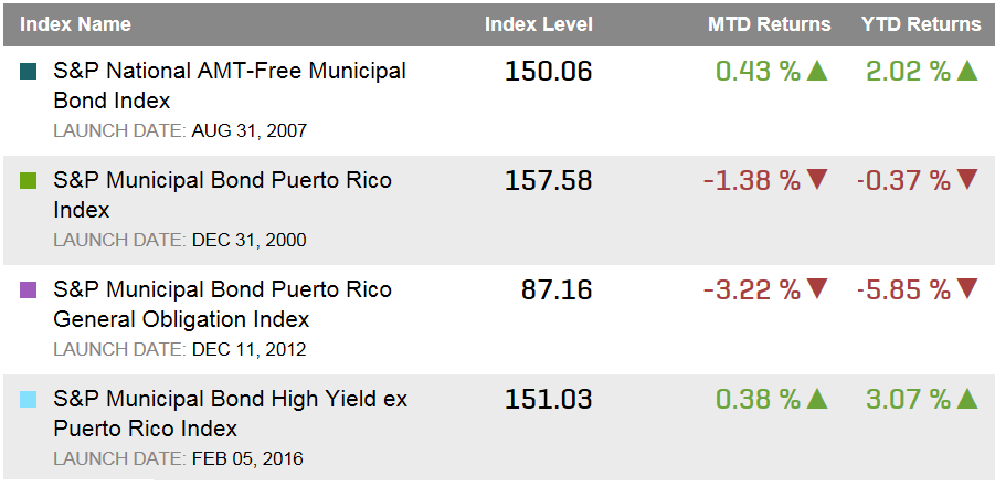
The governor of Puerto Rico has moved forward with a bill to suspend debt payments while looking for Washington to help.  The muni market reacted dragging the General Obligation bonds down further.  The S&P Municipal Bond Puerto Rico General Obligation Index has dropped over 3% in April so far and over 5.8% year-to-date.

Municipal high yields bonds tracked in the S&P Municipal Bond High Yield Index have risen over 2.1% year-to-date, the same index excluding Puerto Rico bonds is up over 3% year-to-date.

Table 1) Selected municipal bond indices and their returns:

Source: S&P Dow Jones Indices, LLC. Data as of April 6, 2016.

The posts on this blog are opinions, not advice. Please read our Disclaimers.

Necessary, but not sufficient

Contributor Image
Tim Edwards

Managing Director, Index Investment Strategy

S&P Dow Jones Indices

In the popular imagination, “big business” is responsible for climate change.  In fact, corporate emissions of greenhouse gasses are a small part of the problem; it is quite possible that corporations also provide our best hope for a solution.

The current reality – what we know to be true – is that governments worldwide are shortly expected to commit to limit their emissions of greenhouse gasses, sufficiently for the global average temperature to rise no more than 2° C above pre-industrial levels.  While the world’s political leaders have been quick to advertise their commitment to this laudable goal, they have so far been reticent in explaining exactly what might be required to meet it.

According to the U.N., the world produced around 37 gigatonnes (Gt) of greenhouse gasses in 2015.  Scientists estimate we can produce roughly another 1,000 Gt of further emissions in total and yet remain within the 2° C limit.  If we allow ourselves 100 years to come up with a technological solution, that implies an annual budget of 10 Gt per year; an annual reduction of around 27Gt.

In context, the world’s blue chip corporations – identified via their inclusion the S&P Global 1200 – account for around 5.2 Gt per annum in aggregate.  A change to corporate emissions patterns may be necessary, but it will not be sufficient.

GG Up

Moreover, as we have indicated, the existence of a non-zero “target” for near-future greenhouse gas emissions is predicated on the future discovery of alternative technologies, capturing and removing carbon from the atmosphere or replacing our energy sources (and allowing, in our example, for the budget to last only 100 years).  More aggressively, several proposals for emissions targets assume a pace of discovery that results in negative net emissions during the second half of this century.  Venturing briefly into the realm of speculation, it seems rather likely that the actions of large corporations seeking new and cleaner sources of energy will be critical in developing the technology and infrastructure to support it.

The conversation around climate change has a propensity to become mired in polemic, politics, and accusations of bad faith.  This is a shame.  It is quite possible to examine the current trends in the light of objective and impartial data.  Through the range and scope of our indices, S&P Dow Jones Indices can provide data on where the impact might be felt, and which investment styles may benefit.  Such analysis of the make-up, importance and distribution of corporate emissions is provided in our latest paper: the S&P Dow Jones Indices Carbon Emitter Scorecard.


The posts on this blog are opinions, not advice. Please read our Disclaimers.

Every Commodity Benefits From A Falling Dollar

Contributor Image
Jodie Gunzberg

Former Managing Director, Head of U.S. Equities

S&P Dow Jones Indices

For the first time since June 2014, the Dollar Spot Index yoy% was negative in March. That was one of the main reasons commodities had such a strong month with the S&P GSCI gaining 4.9% and Dow Jones Commodity Index (DJCI) up 4.0%. Since commodities are priced in US dollars, when the dollar rises, it hurts commodities.

Source: S&P Dow Jones Indices and Bloomberg.

However, not all of the commodity market demise can be blamed on the the strength of the US dollar. Historically in the past 10 years, there is a -0.60 correlation between the rising dollar and commodities, meaning the relationship is negative but not very strongly. More importantly, when the dollar rose year-over year, it increased on average 8.1% driving commodities down 7.0% on average. While some economically sensitive commodities are moved more by the rising dollar, especially in energy, many are less sensitive and some even rise with a rising dollar.

Source: S&P Dow Jones Indices.
Source: S&P Dow Jones Indices. For every 1% move up for the dollar, the up $ market capture ratio measures how much each commodity moves. For example, if the dollar rose 1%, nickel fell 1.907%. When the dollar rose 1%, feeder cattle rose 0.746%.

When the dollar rises, it is possible some opportunistic buying happens to take advantage of cheaper commodities, helping the prices from falling even further. On average the up $ market capture ratio for the commodities is -87.2, meaning for every 1% the dollar rose, commodities on average fell 0.872%.

Now that the dollar has started to fall, it is interesting to note how much more power a falling dollar has in boosting commodities than a rising one hurts. On average when the dollar fell it fell 6.5% year-over-year, pushing commodities up on average 25.5%. The average down $ market capture ratio for commodities is -393.2, meaning for every 1% the dollar fell, commodities on average rose 3.932%. The falling dollar is 4.5 times more powerful than the rising one on commodities. Plus every single commodity benefits from the falling dollar, with the metals gaining most.

Source: S&P Dow Jones Indices.
Source: S&P Dow Jones Indices. For every 1% move down for the dollar, the down $ market capture ratio measures how much each commodity moves. For example, if the dollar fell 1%, lead rose 7.154%. When the dollar fell 1%, natural gas rose 0.687%.

Not only does every single commodity benefit from a falling dollar, but only natural gas gets hurt more by a rising dollar than it gets helped by a falling one. It may be since it is so difficult to store.

Source: S&P Dow Jones Indices.

If the Fed continues its more dovish sentiment, the dollar may fall more, which could be highly beneficial for commodities.


The posts on this blog are opinions, not advice. Please read our Disclaimers.

Great Performance by High Yield, One Time or Early Signs?

Contributor Image
Kevin Horan

Former Director, Fixed Income Indices

S&P Dow Jones Indices

As with the weather for the northern hemisphere, the U.S. high-yield market seems to be making a comeback.  The 0.54% return in February for the S&P U.S. Issued High Yield Corporate Bond Index appears to be the green shoot of return for high-yield bonds.  March 2016 followed the prior month’s gain with a blossom of its own.  The index returned 4.5% for the month, which was the largest monthly return since October 2011’s return of 5.07%.  Year-to-date, the index returned 3.36%, which is refreshing to high-yield investors, who, before this month, had not seen a positive year-to-date return since November 2015.

The S&P 500 High Yield Corporate Bond Index performance behaved similarly returning 3.43% for March, which was the index’s largest return since a 3.86% return in October, 2011.

Source: S&P Dow Jones Indices LLC. Data as of March 31, 2016. Past performance is no guarantee of future results. Table is provided for illustrative purposes.

High yield option-adjusted spreads (OAS) for the year have double peaked, reaching highs of 907 and 883 bps on Jan. 20, 2016, and Feb. 11, 2016, respectively.  Since then, the OAS spread has tightened by 180 bps, giving bankers a window of opportunity to work with issuers in providing more debt to the market before any possible additional rate increase by Fed.  According to IFRMarkets, 57% of Q1 2016 high-yield issuance was sold in March, and at USD 6.3 billion, with the last week of March being the busiest for 2016.  Next week, an additional USD 3-5 billion more is expected.  Notable new issues for the week were included the following.

  • T Mobile USA, Inc., with USD 1 billion of an eight-year maturity and a coupon of 6%.
  • Western Digital Corp., with USD3.35 billion of an eight-year maturity and a coupon of 10.5%.
  • HD Supply Inc., with USD 1 billion of an eight-year maturity and a coupon of 5.75%.
  • BPCE S.A., with USD 750 million of a six-year maturity and a coupon of 8.25%.Exhibit 2: OAS History for the S&P U.S. Issued High Yield Corporate Bond Index

    Source: S&P Dow Jones Indices LLC. Data as of March 31, 2016. Past performance is no guarantee of future results. Chart is provided for illustrative purposes.
    Source: S&P Dow Jones Indices LLC. Data as of March 31, 2016. Past performance is no guarantee of future results. Chart is provided for illustrative purposes.


The posts on this blog are opinions, not advice. Please read our Disclaimers.

Has the ACA Achieved its Goal of Significantly Increasing Enrollment While Making Healthcare Coverage More Affordable? Part 2

Contributor Image
Glenn Doody

Vice President, Product Management, Technology Innovation and Specialty Products

S&P Dow Jones Indices

In part 2 of this blog series, we will look at the effect the 25%+ increase in new membership related to the Affordable Health Care Act (ACA) has had on costs.  From the time of the initial drafting of the ACA rules, there was concern that the new enrollees in the individual insurance market would increase overall costs.  Since many of these enrollees were expected to have pre-existing health conditions, overall costs could go up as utilization increases.  However, the key question that needs to be studied is whether the average cost per person has increased, and if so by how much?

Capture

Looking at Exhibit 1, we can clearly see that the average cost on a Per Member Per Month (PMPM) basis has increased significantly.  When the ACA was under development in 2009-2010, the average PMPM cost was just above USD 160 per person for an individual policy.  However at the same time, the average member covered by an employer-based plan, either large group or self insured, cost just above USD 260, or USD 100 more a month.  Since the introduction of the ACA, and in particular since 2013, we have seen a drastic increase in the PMPM costs for an individual to over USD 360 a month, while employer-based plans are still just below USD 360 a month.

Why the difference?  The key component in the legislation is the requirement that plans are no longer allowed to decline coverage for pre-existing conditions nor charge more for patients with pre-existing conditions.  This means that the once healthy population of members in the individual pool will now have to help cover the costs for more enrollees that are not as healthy.  However, employer coverage pools have always had a predictable sampling of unhealthy individuals.  Further, employer group medical insurance has not discriminated between the healthy and non-healthy, since they provide coverage to everybody.  Now that individual medical policies are required to provide coverage regardless of a person’s health status, it would be expected that PMPM costs should rise to a similar level as the employer coverage, as shown in Exhibit 1.  The key question is, are the ACA rules strong enough to entice the majority of the healthy population to maintain or add coverage in the individual market?  If not, then will average costs continue to rise above, and could individual policies face a “death spiral” rendering them unaffordable?  Keep watching this space as we continue to monitor healthcare costs moving forward.

The posts on this blog are opinions, not advice. Please read our Disclaimers.