Get Indexology® Blog updates via email.

In This List

Active Management in Volatile Markets

Biggest Commodity Comeback Ever

Does Market Volatility Favor Active Management? Evidence From the 2015 Year-End 2015 SPIVA® U.S. Scorecard

Schisms

In Search of the Low Volatility Anomaly

Active Management in Volatile Markets

Contributor Image
Craig Lazzara

Former Managing Director, Index Investment Strategy

S&P Dow Jones Indices

More than a year ago, a number of commentators expressed confidence that 2015 would be the year when active equity management proved its value.  After all, the market had risen steadily for six years, and with stretched valuations, market volatility was likely to rise — creating opportunities for active managers to add value by skillful risk control.

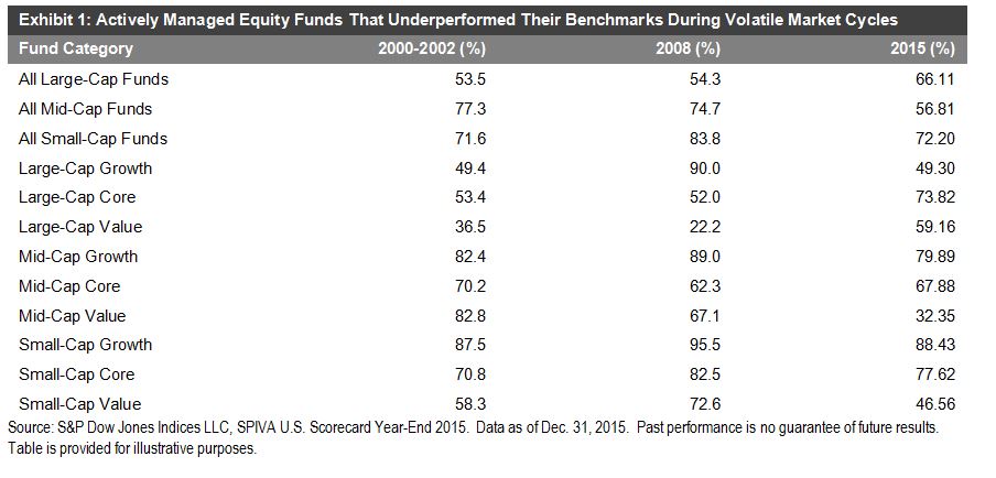
This seems like a plausible theory — if only the facts had not conspired to rebut it.  Our SPIVA report for calendar 2015 shows that the majority of actively-managed U.S. mutual funds underperformed cap-weighted index benchmarks.  Similarly, the majority of large-cap institutional portfolios tracked in the eVestment database underperformed the S&P 500 Index.

Why was 2015 so difficult for active U.S. equity managers?  Answering this question requires us to distinguish between two oft-conflated concepts: the manager’s skill at stock selection or sector rotation, and the level of opportunity to demonstrate that skill.  Beyond observing that, in a market dominated by institutional players, the average manager cannot expect to outperform the market average, we have no particular insight into manager skill.  But opportunity can be measured systematically by the market’s dispersion, and dispersion in 2015, though slightly above 2014’s level, remained quite low by historical standards.

The level of a manager’s skill is independent of dispersion, but the value of his skill is dispersion-contingent.  The graph below illustrates this by reference to the interquartile range for large-cap U.S. managers in our SPIVA database.

Source: S&P Dow Jones Indices’ SPIVA (“S&P Indices Versus Active”) scorecards . Data for 2007 are for December 31, 2006 through March 31, 2007; all other years are full calendar years. Charts are provided for illustrative purposes. Past performance is no guarantee of future results.

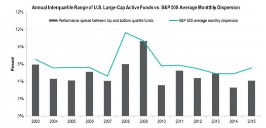
The bars represent the difference between top quartile and bottom quartile managers or, crudely speaking, the performance gap between “good” and “bad” managers in each year.  The line is the average level of dispersion during the year.  It’s hardly a perfect fit, but nonetheless it seems clear that managers have more scope to demonstrate their skill when dispersion is high.

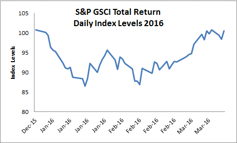
In most markets, dispersion in early 2016 was higher than its average 2015 level.  If this trend continues, 2016 could at last see the long-awaited stock pickers’ market, and a widening of the gap between top and bottom performers.  If dispersion reverts to its 2015 levels, however, even good active managers will continue to face a challenging environment.

The posts on this blog are opinions, not advice. Please read our Disclaimers.

Biggest Commodity Comeback Ever

Contributor Image
Jodie Gunzberg

Former Managing Director, Head of U.S. Equities

S&P Dow Jones Indices

St. Patrick’s Day didn’t just have a pot of gold at the end of the rainbow, but had basically the whole commodity basket. The S&P GSCI that represents the world’s most significant commodities, ended Mar. 17 with a positive total return year-to-date for the first time in 2016, up 1.9%.

Source: S&P Dow Jones Indices.

The index reached its highest level since Dec. 10, 2015, and gained 18.8% since its bottom on Jan. 20, 2016. This is the most the index has ever increased in just 40 days after bottoms.

Source: S&P Dow Jones Indices

Further, now in March, 23 of 24 commodities are positive. This is the most ever in a month with one exception when all 24 commodities were positive in Dec 2010. It is also the fastest so many monthly returns of commodities changed from negative to positive, making a comeback from Nov. 2015 when just two commodities were positive.

Source: S&P Dow Jones Indices.

Now, only aluminum is negative in Mar., down 3.1%. However, its roll yield recently turned positive that shows more scarcity (that is very rare for aluminum,) indicating it may turn with the rest of the metals. Especially if the U.S. dollar weakens, the industrial metals tend to benefit most of all commodities. That says a lot about their economic sensitivity given all commodities rise with a weak dollar.


The posts on this blog are opinions, not advice. Please read our Disclaimers.

Does Market Volatility Favor Active Management? Evidence From the 2015 Year-End 2015 SPIVA® U.S. Scorecard

Contributor Image
Aye Soe

Former Managing Director, Global Head of Core and Multi-Asset Product Management

S&P Dow Jones Indices

Twice a year, S&P Dow Jones Indices releases the SPIVA U.S. Scorecard.  The scorecard measures the performance of actively managed equity and fixed income funds across various categories.  Since the initiation of the report in 2002, the results have consistently shown that managers across most categories overwhelmingly underperform on a relative basis against their corresponding benchmarks over a medium- to long-term investment horizon.

The Year-End 2015 SPIVA U.S. Scorecard reveals little surprise.  The second half of 2015 was marked by significant market volatility, which was brought forth by plunging commodity prices, a strengthening U.S. dollar, growing global concerns over Chinese economic growth, and the subsequent devaluation of the Chinese renminbi.

Market volatility, in theory, favors active investing, because managers can tactically move out of their positions at their discretion and park themselves in cash.  Passive investing, on the other hand, has to remain fully invested in the market.  Investors in actively managed strategies should therefore realize fewer losses during periods of heightened volatility, all else being equal.

Given this theoretical background, recent volatility in the market has supporters of active investing proclaiming that active management is back in favor.

However, over a decade of experience in publishing the SPIVA Scorecard has painfully taught us that active funds don’t always perform better than their passive counterparts during those precise periods in which active management skills seem to be called for.  Exhibit 1 compares the performance of actively managed equity funds across the nine style boxes during the 2000-2002 bear market, the financial crisis of 2008, and 2015.

As the data clearly show, there is no consistent pattern across most of the categories.  Large-cap value managers appear to be the only exception to the losing trend, outperforming their benchmark in both bear markets.  Again in 2015, mid-cap value is the only winning equity category, with the majority (67.65%) of them outperforming the S&P MidCap 400® Value.

Capture

The posts on this blog are opinions, not advice. Please read our Disclaimers.

Schisms

Contributor Image
David Blitzer

Former Managing Director and Chairman of the Index Committee

S&P Dow Jones Indices

The world seems to be awash with schisms these days.  There are always great divides in politics, but this year they seem greater than usual.  However, the schisms and splits in the financial world matter more for now: at the Fed, in differing growth rates among the US, Europe and China, and between stocks and oil.

The Fed appears to be divided between the hawks and doves when it comes to raising interest rates. Two speeches last week establish the contrasting positions. Fed Vice Chair Stanley Fischer suggested that inflation may be about to increase while affirming his belief that the Phillips Curve – the inverse relation between unemployment and inflation – is still is worth watching after six years of declining unemployment and flat to falling inflation.  The same day Fed Governor Lael Brainard noted that economic weakness abroad poses a risk to the US, suggesting the Fed might be better off not raising interest rates this year.  This schism should assure no change in the Fed funds target rate on Wednesday when the FOMC meeting issues its statement.

If there is such a thing as a three way schism, it is among growth in the world’s major economies. The US managed 1.9% real GDP growth in 2015, more than double the amount experienced in the Eurozone (0.4%), the UK (0.5%) or Japan (0.8%), but not even close to China’s 6.9% pace.  Even though China’s numbers are expected to slip slightly, this wide spread means that national economic policies may be working against one-another rather than together.  Expect conflicting arguments about managing currency exchange rates or losing jobs overseas.  The US dollar rose about 15% against major world currencies from mid-2014 to mid-2015; putting pressure on US exports while helping other nations’ export activity.

The relative behavior of stocks and the price of oil are another puzzle, although some recent analysis may hold an answer.  The chart shows the prices of the S&P 500 and WTI oil since the beginning of 2014. At first glance the two series move in opposite directions.  Since cheap oil is favorable for most US companies one would expect lower oil prices to be a positive factor for the stock market. However, this pattern reversed for a few weeks last summer and again since the start of 2016.  Two factors that would affect both oil prices and stocks the same way may be behind these reversals. Signs of increasing or decreasing global demand would cause both series to move together, overcoming the impact of lower oil costs. A second factor would be risk-on/risk-off which would push speculators out of both the oil and stock market.  A detailed econometric analysis of these factors is offered by Ben Bernanke.

The posts on this blog are opinions, not advice. Please read our Disclaimers.

In Search of the Low Volatility Anomaly

Contributor Image
Fei Mei Chan

Former Director, Core Product Management

S&P Dow Jones Indices

By now we’re very familiar with the oft discussed “Low Vol Anomaly”. Diverging from conventional finance theory, which tells us that risk and return are directly related, low volatility stocks have outperformed over time and, as expected, with lower volatility. Ample research and evidence point to the existence of a low volatility factor comparable to other factors such as beta or small size or cheap valuation. Because this seems to fly in the face of what we think we know about risk and return, the low volatility factor is often referred to as the low volatility “anomaly.” The S&P 500 Low Volatility Index, for example, outperformed its parent S&P 500 (annual growth rate of 10.9% and 9.8%, respectively) despite exhibiting lower risk in the period between 1991 and 2015.

These returns are a snapshot spanning a 25-year period. Low Vol has, of course, underperformed at times during this period, most notably during the inflation of the technology bubble. The chart below maps the five-year performance spread on a rolling basis for a better picture of how Low Vol has behaved over time. Recently Low Vol’s performance spread has drifted around zero. Does this imply that the “low volatility anomaly” is spluttering?

in search of the low vol anomaly1

We recently developed a simple methodology that can be used to assess the performance of factor (or other) indices compared to their cap-weighted parents. The methodology attributes a factor index’s excess returns both to its incremental (or decremental) level of risk and to a changed tradeoff between risk and return. We ascribe Low Vol’s “anomaly” to the tradeoff portion of the performance differential and the chart below tracks this element of return on a rolling 5-year basis. The recent performance challenges of Low Vol are attributable to its reduced level of risk in an environment that, until recently, has been favorable for risk-taking. Contrary to what the performance differentials suggested, the low volatility anomaly, as defined by improved tradeoff between risk and return, is alive and well.

in search of the low vol anomaly2


The posts on this blog are opinions, not advice. Please read our Disclaimers.