Get Indexology® Blog updates via email.

In This List

Factor-Based Investing in US IG Corporate Bonds: Volatility and Credit Spread

Be Careful What You Wish For

Why January's Commodity Performance Is Promising

A Better Mousetrap: Smart Beta Offers Superior “Risk-On/Risk-Off” Relative-Strength Signals

Top Three Questions About Japan’s Bond Market

Factor-Based Investing in US IG Corporate Bonds: Volatility and Credit Spread

Contributor Image
Hong Xie

Former Senior Director, Global Research & Design

S&P Dow Jones Indices

Factor-based investing in equities is a well-established concept supported by over four decades of research. However, factor-based investing in fixed income remains in its nascent stages. Our analysis has found that factor-based fixed income strategies implemented in a rules-based, transparent index can represent an alternative tool for fixed income portfolio construction. In the next few blogs, we will detail our approach to and back-tested results of employing credit spread (value) and volatility as factors in order to systematically construct a portfolio of U.S. investment-grade corporate bonds.

Investment Philosophy
In practice, an active portfolio manager for a corporate bond mandate mostly focuses on credit returns, specializing in expressing views on the direction of credit spreads and security selection. We propose a two-factor model to seek to collect an active return from security selection, identifying relative value opportunity in credit returns while keeping portfolio duration and credit duration natural to the underlying universe.

Two Factors: Volatility and Credit Spread
To achieve better security selection, we chose two factors that empirically have demonstrated a strong relationship between factor exposure and performance statistics and that have long been incorporated in investment analysis by corporate bond portfolio managers. Our selection of factors was by no means exhaustive.

The fixed income investment community has long used volatility in analyzing bond valuations and identifying investment opportunities. We have defined volatility as the standard deviation of bond yield changes for the trailing six-month period. All else being equal, the more volatile the bond yield is, the higher the yield needs to be in order to compensate for the volatility risk.

For the credit spread factor, we consider the option-adjusted spread (OAS), which represents the yield compensation for bearing credit risk and other risks associated with credit. OAS is a common measure of valuation for corporate bonds.

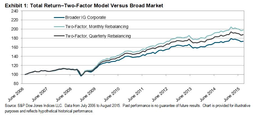
Back-Testing Total Return

Exhibit 1 shows the cumulative total return for our two-factor model versus the broad market. In the next post, we will demonstrate how we identify these two factors.

Capture

The posts on this blog are opinions, not advice. Please read our Disclaimers.

Be Careful What You Wish For

Contributor Image
Craig Lazzara

Former Managing Director, Index Investment Strategy

S&P Dow Jones Indices

One of the few things more reliable than active managers’ general run of underperformance is their confidence that, despite what happened last year, this year will be different.  Two years ago, e.g., active managers were arguably poised to excel because correlations had declined from their financial crisis peaks; a year ago it was active managers’ putative ability to navigate declining markets that provided the rationale.  The data contradict both arguments, of course — there’s no reliable tendency for active management performance to improve when correlations are low or when markets are weak.

When considering whether we’re in an attractive environment for active management — the long-sought “stock picker’s market” — it’s important to bear in mind the difference between the existence of skill and the value of skill.  Suppose I am blessed with the ability to identify stocks whose performance is one standard deviation better than a market index’s average return.  The value of my skill will increase as the spread among stocks in the index widens.  If I were (or thought I were) a good stock picker, I would want to operate in an environment of widely-dispersed returns.

Dispersion, in fact, is a systematic measure of the weighted standard deviation of index component returns, and gives us a way to gauge the potential benefit of active stock selection.  In January 2016, dispersion in the S&P 500 rose sharply, reaching its highest level in more than four years.

S&P 500 dispersion_Jan 2016

One month does not a new regime make, of course, but the trend in the data suggests that S&P 500 dispersion may be beginning to climb above its long-compressed level.  High dispersion goes hand in hand with high volatility, however, and high volatility often signals negative returns.

Thus the irony: active equity managers may finally have the stock picker’s market for which they’ve hoped.  But the price of a stock picker’s market may be, at least in the short run, a period of volatile and negatively-biased returns.

The posts on this blog are opinions, not advice. Please read our Disclaimers.

Why January's Commodity Performance Is Promising

Contributor Image
Jodie Gunzberg

Former Managing Director, Head of U.S. Equities

S&P Dow Jones Indices

Considering commodities were on pace to set the worst January since 1975 at one point, down 14.3% by Jan. 20, the final monthly loss of just 5.2% is impressive. The S&P GSCI Total Return rebounded 10.6% with nine of the twenty four commodities posting gains for the month.

Does this mean commodities hit the bottom or that this is just a bounce in a much darker scenario? That probably depends on the oil supply decisions from Saudi Arabia, Russia and Iran, in addition to Chinese demand growth, the strength of the dollar and the weather. However, an examination of the historical annual performance of the S&P GSCI based on the direction of returns in January for single commodities and sectors gives hope that 2016 may be a positive year.

Again, nine of the twenty four commodities in the S&P GSCI were positive in January. Historically, there is a higher chance the year will end positively than negatively based on the first month’s performance for seven of those commodities. The most interesting statistic of the positive single commodities is that when gold has gained in January, the S&P GSCI has gained for the year almost 3 of every 4 times, or in 72% of the time. Gold gained 5.3% in January 2016, so there may be a 72% chance of a positive year in 2016 for the S&P GSCI, based on that historical data point.

What is more compelling is that of the fifteen negative commodities, only three have had the majority of years ending negatively based on their losing January months. For most of petroleum, the first month’s direction is only as good as a coin flip, but when Brent Crude loses, that has been a good thing in 63% of years for the S&P GSCI. Another namesake commodity, copper, that many watch as an indicator of economic health, lost 3.1% in January, but based on history, the S&P GSCI has gained in 68% of years where copper lost in the first month.

On average, there is a 59% chance of a positive year in 2016 for the S&P GSCI  based on the number of times in history positive years have followed the direction of commodities this past January. The sectors tell the same story with a slightly higher chance, 64%, of a positive commodity year in 2016. Still, the outcome for the year is uncertain, especially since the direction of the January performance of the S&P GSCI itself, doesn’t say much. According to the historical data, there is only a slightly greater chance, 53%, of a negative year than a positive one in 2016.

Source: S&P Dow Jones Indices. Historical performance is not indicative of future results.


The posts on this blog are opinions, not advice. Please read our Disclaimers.

A Better Mousetrap: Smart Beta Offers Superior “Risk-On/Risk-Off” Relative-Strength Signals

Contributor Image
Sam Stovall

U.S. Equity Strategist

S&P Capital IQ

Technicians frequently compare the performance of the S&P Consumer Discretionary sector with the Consumer Staples sector for guidance on the market’s “risk-on” or “risk-off” trend. When the more cyclical Consumer Discretionary sector, which contains such sub-industries as autos, homebuilding and retail, outperforms the more defensive Consumer Staples group, which includes food, beverage and tobacco firms, investors look upon that as a sign that the S&P 500 is entering into, or maintaining, an upward trend, and vice versa. History tells us, however, that the S&P High Beta (SPHB) and Low Volatility (SPLV) Indices offer a better market-timing mousetrap.

As the name implies, the S&P 500 High Beta Index measures the performance of 100 stocks within the S&P 500 that have the highest trailing 12-month standard deviations. On the other hand, the S&P 500 Low Volatility Index consists of the 100 stocks with the lowest volatility.

One of the drawbacks of monitoring the Consumer Discretionary/Consumer Staples (CD/CS) relative strength is that nearly 40% of the sub-industries in the Consumer Discretionary sector (and 44% of the cap-weighting) have betas that are equal to or lower than the market itself. A glaring example is Restaurants, which is dominated by the fast-food giant McDonalds, a company more frequently associated with defensiveness than cyclicality. This group, which represents 11.5% of the Consumer Discretionary sector, has a beta of 0.6. As a result, an investor seeking to compare apples with oranges through the CD/CS relative strength, actually ends up comparing something closer to oranges with tangerines.

Capture

To see which indicator – CD versus CS or HB vs. LV – was better at offering “risk on/risk off” guidance, I looked at monthly price performances over the past 20 years, capturing the S&P 500’s price return whenever the cyclical index (CD or HB) beat the defensive index (CS or LV), but applying no change when the defensive index beat the cyclical one. Obviously, I had no way of knowing in advance if CD or HB would beat their respective defensive counterparts in the month ahead. I was merely interested in seeing which pair delivered superior results whenever their market timing signals were either “on” or “off.”

The S&P 500’s price-only compound annual growth rate (CAGR) from 12/31/95 through 12/31/15 was 6.2%. However, by owning the S&P 500 when CD beat CS, and then switching into cash when CS beat CD, the 20-year CAGR jumped to 14.9%. However, owning the S&P 500 when HB beat LV, and in cash during those months when LV beat HB, the CAGR soared to 20.9%.

So there you have it. There is now an alternative for those who chart the relative performance of the S&P 500 Consumer Discretionary sector against the S&P 500 Consumer Staples sector, but have been a bit disappointed with recent signals. A new and better mousetrap, in my opinion, is available by monitoring the relative strength of the S&P 500 High Beta and Low Volatility Indices. When HB is beating LV, its best to stay in stocks. Yet when LV outshines HB, it has usually been wise to take a powder. Of course there’s no guarantee that what worked in the past will work again in the future.

Register for S&P DJI’s complimentary live streamed event for financial advisors, “Where Can Smart Beta Take You?”

—————————————————————————————————–

S&P Capital IQ operates independently from S&P Dow Jones Indices.
The views and opinions of any contributor not an employee of S&P Dow Jones Indices are his/her own and do not necessarily represent the views or opinions of S&P Dow Jones Indices or any of its affiliates.  Information from third party contributors is presented as provided and has not been edited.  S&P Dow Jones Indices LLC and its affiliates make no representations or warranties of any kind, express or implied, regarding the completeness, accuracy, reliability, suitability or availability of such information, including any products and services described herein, for any purpose.

The posts on this blog are opinions, not advice. Please read our Disclaimers.

Top Three Questions About Japan’s Bond Market

Contributor Image
Michele Leung

Former Director, Fixed Income Indices

S&P Dow Jones Indices

Question One: How big is Japan’s local currency bond market?  How does it compare to China’s bond market?

The size of the local currency bond market in Japan (tracked by the S&P Japan Bond Index) stood at JPY 1,154 trillion as of Jan. 27, 2016, which is equivalent to USD 9.7 trillion.  It is 1.7 times the size of the local currency bond market in China, as measured by the S&P China Bond Index.  Japanese sovereign bonds represent over 70% of market exposure; the current yield-to-maturity of the S&P Japan Sovereign Bond Index is 0.22%, compared with 2.83% for the S&P China Sovereign Bond Index.

Question Two: How did bonds perform in 2015?

The S&P Japan Bond Index gained 0.87% in 2015, benefiting from a rally in the last quarter (see Exhibit 1).  The index’s yield-to-maturity tightened by 15 bps to 0.24% in the same period.  In government bonds, the S&P Japan Sovereign Bond Index outperformed and increased 1.04%.  Within the corporate sectors, the S&P Japan Utilities Bond Index was up 0.95%, beating other sectors like financials, services, and industries.

Question Three: What about inflation-linked bonds?

Riding on weakening inflation expectations, the S&P Japan Sovereign Inflation-Linked Bond Index dropped 0.63% for the year.  The index’s yield-to-maturity has remained in negative territory since the second half of 2015 and stood at -1.15% as of Jan. 27, 2016.

The Bank of Japan (BoJ) announced on Jan 29 that it will apply a rate of negative 0.1% to excess reserves that financial institutional place at the bank, with the goal to push down borrowing costs to stimulate inflation. The BoJ aims to meet its 2% inflation target; reaching that target has been delayed due to weak consumer spending and the deflationary impact of the drop in oil prices.

Exhibit 1: Total Return Performance of the S&P Japan Bond Index

20160127

The posts on this blog are opinions, not advice. Please read our Disclaimers.