Get Indexology® Blog updates via email.

In This List

The Rieger Report: Cost of Buying Default Protection in Energy Sector Up 185%

The Volatility of Bond Markets

Your Gas Prices Should Be Cheaper

The Outlook for Active Alpha

Islamic Index Market Update: November 2015

The Rieger Report: Cost of Buying Default Protection in Energy Sector Up 185%

Contributor Image
J.R. Rieger

Former Head of Fixed Income Indices

S&P Dow Jones Indices

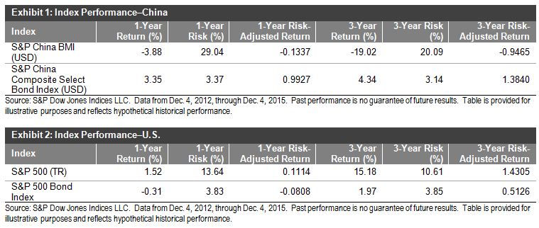
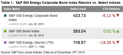
Some high yield bond funds are reeling with the impact of the price of oil on energy related companies with debt.  The S&P 500 Energy Corporate Bond Index, tracking over $255billion in debt, is down over 6% year-to-date while the overall S&P 500 Bond Index remains in positive territory.  Energy bonds have been less volatile than the stock of these companies but a 6% drop is painful for bond investors.

12 10 2015 Table 1

12 10 2015 Chart 1

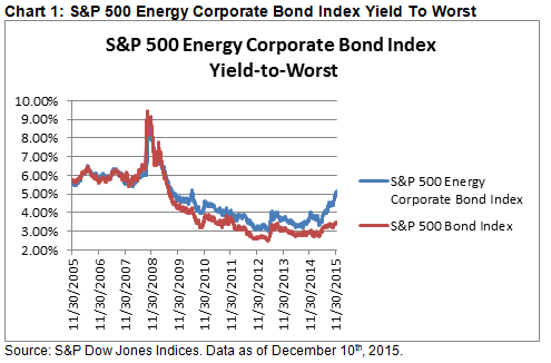
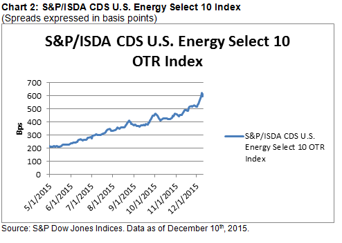
More telling is how the credit markets are viewing the cost of buying default protection on the debt of energy related companies.  The cost of buying default protection has risen by 185% since May 1st, 2015 indicating the credit markets are expecting more distress in the sector over the near term.  Based on the index the cost per $100,000 of protection on May 1, 2015 was $2,130 and the cost per $100,000 of protection on December 10th was $6,080.

12 10 2015 Chart 2


The posts on this blog are opinions, not advice. Please read our Disclaimers.

The Volatility of Bond Markets

Contributor Image
Michele Leung

Former Director, Fixed Income Indices

S&P Dow Jones Indices

China’s onshore bond market recorded strong growth in the first 11 months of 2015 and its total return has increased 6.98% year-to-date (YTD), as measured by the S&P China Bond Index.  The S&P China Composite Select Bond Index, an investable index that tracks the performance of Chinese sovereign bonds, agency bonds and bonds issued by Central State-Owned Enterprises (CSOEs) rose 7.00%; the USD index that accounted for currency fluctuation gained 3.04% in the same period.

The one-year volatilities of Chinese bonds were 2.13% in CNY and 3.38% in USD.  The volatility of Chinese bonds is low when compared with the equity market; the volatility of Chinese equities over the past one- and three-year periods was more than tenfold that of Chinese bonds.  Chinese bonds have consistently outperformed Chinese equities, both in terms of total return and risk-adjusted return (see Exhibit 1).

Looking at the performance of the U.S., we have similar findings.  The volatility of U.S. equities over the past one- and three-year periods was approximately three times that of U.S. bonds, as tracked by the S&P 500® Bond Index.  The S&P 500 Bond Index seeks to measure the performance of U.S. corporate bonds issued by constituents in the iconic S&P 500.  Though the total return of U.S. bonds may be lower, the risk-adjusted returns of U.S. bonds were comparable to those of U.S. equities over the past year (see Exhibit 2).

Based on this information, we can conclude two key observations in both U.S. and Chinese markets.

  • These bond markets have substantially lower volatility than their respective equity markets.
  • These bond markets have historically delivered comparable, if not better, risk-adjusted returns than their respective equity markets.

20151207

The posts on this blog are opinions, not advice. Please read our Disclaimers.

Your Gas Prices Should Be Cheaper

Contributor Image
Jodie Gunzberg

Former Managing Director, Head of U.S. Equities

S&P Dow Jones Indices

Think your gas prices are cheap? Think again.

The oil price drop since June 2014 has moved to become one of the most important factors in the global economy. Despite agreement on a chance to change policy, it has divided the world into winners and losers based on importers and exporters. Presumably the winners are the importers, but the countries that can highly benefit are the ones whose refiners pass through the price drop of the cheaper oil input down to the customers at the pump.

The U.S. Energy Information Administration (EIA) performed a study in Nov. 2014 concluding U.S. gas prices are more related to Brent than WTI. Further, the study noted U.S. crude exports could impact Brent prices and that gasoline is a globally traded commodity, so prices are highly correlated across global spot markets. The S&P GSCI Brent Crude and S&P GSCI (WTI) Crude Oil are highly correlated at 0.94 that shows the prices are highly related.

Historically, using monthly data back to Jan. 1988, the S&P GSCI All Crude (that is comprised of both WTI and Brent) has dropped in 156/336 months and the S&P GSCI Unleaded Gasoline has dropped in 127 of those 156 negative months, in other words they fall together about 82% of the time.  Also, generally, unleaded gasoline has moved slightly less than the all crude index, losing 5.9% on average in a negative oil month where the average oil drop is 6.7%, producing a down market capture ratio of 87.2, meaning unleaded gasoline drops about 87.2% as much as oil.  Conversely, in months when oil rose, it gained 7.1% on average but unleaded gasoline only rose 6.6% for an up market capture ratio of 93.1, meaning gas gains 93.1% as much as oil. Notice how closely unleaded gasoline and crude oil move together in the chart below:

Source: S&P Dow Jones Indices.

Consistent with history, from the top of the oil market in June 2014 through the end of 2014, both oil and gas fell similarly, down 49.5% and 52.4%, respectively. The chart below shows this:

Source: S&P Dow Jones Indices

That’s a painful drop for both, but the producer holds more risk than the processor since the processor can make choices the producer can’t. For example, if prices fall, producers lose if they are unhedged; however, if the prices rise, processors can substitute or pass through price hikes to the retail consumer.

Gas refiners sure took advantage once the market turned up in the beginning of 2015 as it seems they needed to make up some of their losses from passing through savings on the cheaper oil. Now, the relationship changed. When oil gained just over 5% in the first six weeks of the year, unleaded gasoline increased almost 35% or seven times oil. Then as oil continued to rise another 10% through May, gas rose another 7%.  In total unleaded gasoline’s increase almost tripled the increase in oil. Since the peak, both oil and gas have dropped significantly, but the drop is more in-line with history with oil falling 38.9% and gas falling 41.2%. The net result is that unleaded gasoline’s drop is only half of oil’s for the year with gas down just 15.7% versus oil’s loss of 29.2%. This is shown in the chart below:

Source:S&P Dow Jones Indices.

The result is that while oil is the cheapest in more than 11 years, since June 2004, gas is only at its cheapest in six years, since Jan 2009.  Based on the historical similarities, one might think their gas price should be 6% cheaper, back down to levels seen in 2004, rather than just back to 2009 levels.

Another place you can observe this relative refiner gain is in the market values of the energy stocks in the S&P 500 Energy Sector. As of Dec. 7, Valero, a major refiner, gained $9.4B in market value this year (+36%) versus a sector loss of $359B where Exxon lost $71B (-18%), followed by Kinder Morgan’s loss of $53B (-60%).

Again, this relationship is global. For example, in the UK, Morrisons has cut petrol to the lowest level since 2009. This level is precisely where the unleaded gasoline index level is now, so arguably this news is not a race for promotion ahead of the holidays. In fact, the news story points out that this drop is EXCLUDING SPECIAL PROMOTIONS. The price cut is just bringing Morrisons price to the global average. If the retailers really wanted to give you a deal, they might bring the gas price back in line to match the oil price drop, putting the price at 2004 levels. The retailers are keeping 5 extra years worth of pricing profits from the customers. Maybe the SPECIAL PROMOTIONS will offer the fair price of gas by passing through the whole oil price drop to the customers,


The posts on this blog are opinions, not advice. Please read our Disclaimers.

The Outlook for Active Alpha

Contributor Image
Craig Lazzara

Former Managing Director, Index Investment Strategy

S&P Dow Jones Indices

Aficionados of our SPIVA reports will recognize that most active managers underperform passive benchmarks most of the time.   For example, between 2000 and 2014,  a majority of large-cap U.S. managers beat the S&P 500 in only three calendar years.  The records of mid-cap managers against the S&P MidCap 400 and small-cap managers against the S&P SmallCap 600 are equally undistinguished.

Since they’re relatively uncommon, years when the majority of managers do outperform naturally attract our attention.  For example, in 2013, two-thirds of all Canadian equity managers beat the S&P/TSX Composite, a dramatic improvement from results in 2012 and prior years.  What was special about 2013?  Perhaps it was that the S&P/TSX Composite was up 13%, while the S&P 500 rose by better than 32%.   Given the difference in Canadian and U.S. returns, a Canadian manager who made a tactical foray south of the border in 2013 might have been very well rewarded for doing so.  (In 2014, when Canadian and U.S. returns were much closer, only 26% of Canadian managers outperformed.)

Similarly, for four consecutive years between 2007-2010, the majority of U.S. large-cap value managers outperformed the S&P 500 Value Index.  Of course, those years straddled the global financial crisis, during which time the S&P 500 Value Index declined by a cumulative -13.5%.  Meanwhile, the S&P 500 Growth Index rose by a cumulative 7.5%.  Perhaps value managers as a group were aided by an ability to tilt toward higher-growth issues.

What these examples illustrate is that there are at least two ways to skin the active management cat.  We can call them, broadly, selection and allocation, and we’ve been looking at examples of successful allocation calls — from Canada into the U.S., e.g., or from value into growth.  Selection, on the other hand, denotes the process of overweighting and underweighting issues within a manager’s benchmark index.  Managers can add (or lose) value by both selection and allocation, but the likely magnitude of their success is conditioned by different things:

  • Stock selection is most valuable in periods of high dispersion.  Dispersion is a formal measure of the degree to which the best performers in an index are outperforming the worst.  The higher a market’s dispersion, the higher the value of a manager’s stock selection skill.
  • Allocation strategies — be they among countries or within segments of a single equity market — likewise are potentially most profitable when the dispersion among component returns is high.

What does this tell us about 2015’s likely results for active U.S. equity managers?

  • Selection strategies face significant headwinds.  Although U.S. dispersion will probably finish 2015 slightly ahead of 2014’s record low, it remains well below its long-term historical average.
  • In 2015, the selection odds are against you.  In most years, the S&P 500 Equal Weight Index, which tells us the return of the average stock, outperforms the S&P 500.  When this happens, the implication is that most randomly-chosen portfolios would outperform the (cap-weighted) market average.  But through December 9, 2015, equal weight is lagging cap weight — the S&P 500’s total return is 1.44%, versus -2.23% for the S&P 500 Equal Weight.  The concentration of performance in larger-cap names exacerbates the challenges posed by low dispersion.
  • Allocation strategies along the capitalization scale won’t help.  In some years there are substantial differences in performance between, say, the S&P 500 and the S&P MidCap 400.  In such times, managers benchmarked against the worse performer can benefit by tilting in the direction of the better performer.  Through December 9, total returns were 1.44% for the S&P 500, -1.65% for the S&P MidCap 400, and -1.24% for the S&P SmallCap 600.  So large-cap managers can’t hide by moving down the cap scale.
  • On a more cheerful note, value managers have a better chance of outperforming than do growth managers.  Through December 9, the S&P 500 Value Index had declined -3.53%, while the S&P 500 Growth Index had risen 6.04%.  A value manager who makes an allocation toward growth may well benefit; not so the growth manager who goes in the opposite direction.

In 2014, 86% of large-cap managers lagged the S&P 500.  2015’s results may be somewhat better, but conditions for active managers should continue to be difficult.

The posts on this blog are opinions, not advice. Please read our Disclaimers.

Islamic Index Market Update: November 2015

Contributor Image
Michael Orzano

Head of Global Exchanges Product Management

S&P Dow Jones Indices

Most Major Islamic Indices Outperformed Conventional Benchmarks in 2015
Most S&P Dow Jones Shariah-compliant benchmarks outperformed their conventional counterparts through November 2015, as the financial sector—which is underrepresented in Islamic indices—has underperformed, and information technology and health care—which tend to be overweight in Islamic Indices—have been top performers.

Capture

The S&P Global BMI Shariah and Dow Jones Islamic Market World Indices have been nearly flat year-to-date (YTD) as of Nov. 30, 2015, outperforming their conventional counterparts by about 2% each in U.S. dollar terms.  Over the same period, the S&P 500 Shariah gained 2.1%, beating the 1.0% gain of the S&P 500.  Islamic indices covering the Asia-Pacific region, Europe, emerging markets, and Pan-Arab equities all outperformed their conventional counterparts as well.

Global Equity Markets Recovered in October Led by U.S. Equities
Following a major summer downturn, global equity markets recovered in October, led by the U.S., which stands as the only major global region in positive territory as of the end of November in U.S. dollar terms.  It is important to note that the strengthening U.S. dollar has weighed on unhedged, non-U.S. equity returns.  Asia-Pacific and European markets are well in positive territory in local currency terms, as the Dow Jones Asia/Pacific Index and Dow Jones Europe Index have gained about 5% and 8% YTD, respectively.  Despite some recent stability in emerging market equities and currencies, the Dow Jones Emerging Markets Index remains down double-digits YTD.

Capture

MENA Equities Underperform as Oil Weakness Continues to Weigh on Returns
In contrast to other regions, MENA equities have continued to weaken in the first two months of the fourth quarter, as oil prices have continued to decline.  The S&P Pan Arab Composite Shariah has fallen nearly 15% YTD in U.S. dollar terms, trailing all other regions by a substantial margin, despite not experiencing the adverse currency effects versus the U.S. dollar that have affected other regions.

The posts on this blog are opinions, not advice. Please read our Disclaimers.