Government intervention globally has driven yields lower, as the yield of the S&P Global Developed Sovereign Bond Index is down 34 bps to 0.74% from the start of 2015 (1.08%). The U.S. Fed finished its quantitative easing program in October. Japan has been in the process of purchasing securities, and the European Central Bank has started purchasing as well, in order to stave off deflation.
Headlines* globally tout record-setting lows:
Italy Sells Bonds at Record-Low Yields as ECB Backstops Demand
Poland to Sell First Euro Bond in Year as ECB Drives Down Yields
South Korean Bond Yields Drop to Record on Rising Rate-Cut Bets
The recent March 18, 2015, FOMC announcement pushed the interest rate increase speculation out toward later in the year, while moving the yield of the S&P/BGCantor Current 10 Year U.S. Treasury Bond Index lower by 14 basis points in one day (to 1.92% from 2.05%). The yield level of the index is now 1.93%, and the index has returned 0.76% MTD and 3.06% YTD as of March 31, 2015.
The recent stimulus buying by the ECB has pushed the yield of the S&P Eurozone Developed Sovereign Bond Index down to 0.42%. Presently, the index has returned 1.16% MTD and 4.02% YTD.
The S&P Japan Sovereign Bond Index’s yield is at 0.33%, as Japan’s central bank has been purchasing a broader selection of securities than just Japanese Government Bonds for a much longer time than Europe. The index has returned 0.04% MTD and is down -0.45% YTD as of March 31, 2015.
One has to wonder, if the U.S. Fed does eventually raise short-term rates, would the yield curve remain flat, or would global demand for longer assets move the curve into an inverted state?
Exhibit-1: S&P Global Developed Sovereign Bond Index
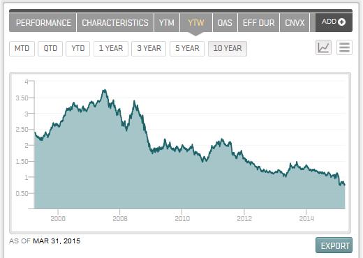
Source: S&P Dow Jones Indices LLC. Data as of March 31, 2015. Charts and tables are provided for illustrative purposes only. Past performance is no guarantee of future results.
*Bloomberg Headlines
The posts on this blog are opinions, not advice. Please read our Disclaimers.