Get Indexology® Blog updates via email.

In This List

Cracking Contango: Brent-Gas Hits 6-Year Seasonal Low

Observations on January Release of S&P Claims Based Indices (Allowed Charge Trends): Part 3

Miss The Commodity Bottom? There Might Be Time.

Shelter from the Storm

Asia Fixed Income: China Onshore vs. Offshore

Cracking Contango: Brent-Gas Hits 6-Year Seasonal Low

Contributor Image
Jodie Gunzberg

Former Managing Director, Head of U.S. Equities

S&P Dow Jones Indices

The Brent crude oil and unleaded gasoline price difference, or “crack spread“, is a widely followed relationship to measure the value extracted along the chain of producing oil to refining it that can serve as a proxy for profit margins.  The EIA (Energy Information Agency) reported global gasoline supply and demand patterns have been evolving with demand greater than supply in Asia, Latin America, and the Middle East. In the U.S., the production of gasoline has been outpacing the demand, resulting in increasing exports of U.S. gasoline into the global market. Despite the relative cheapness of U.S. gasoline to the international markets from the fundamentals, the transportability has allowed benchmarks to measure the global seasonality.

gasoline exports

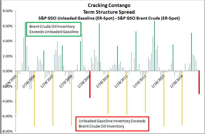
In indexing, the difference in roll yields can be measured to theoretically reflect the relationship between excess and shortage in the oil and gas markets since it is the storage markets that drive the shape of the curves.  There is a historically wide roll spread between unleaded gasoline and brent crude oil, seasonally in each February, where the excess inventory of unleaded gasoline markedly exceeds the excess inventory of brent. What is interesting so far this February is that the spread is the narrowest in six years.

Source: S&P Dow Jones Indices. Past performance is not an indication of future results.

According to the IEA (International Energy Agency), global refining capacity is expected to rise after falling to a six-year low and that global refinery margins will come under renewed pressure. They predict further consolidation in the refining industry, especially in Europe and developed Asia as product markets continue to expand and globalise.

While the excess inventory of brent crude oil is larger at this time than in last February, when brent showed a shortage with a positive roll yield, the excess inventory of unleaded gasoline shown by the roll yield of -3.3% is down half from last year and is seasonally very low. This is illustrated in the graph below:

Source: S&P Dow Jones Indices. Past performance is not an indication of future results.

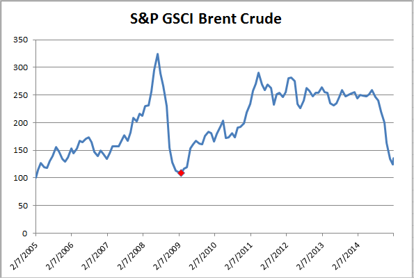
The last time the roll spread was this narrow in February 2009, it marked the bottom of brent. The fundamentals are different this time, driven much more by supply than demand, but the resulting inventory is what might matter most.

Source: S&P Dow Jones Indices. Past performance is not an indication of future results.


The posts on this blog are opinions, not advice. Please read our Disclaimers.

Observations on January Release of S&P Claims Based Indices (Allowed Charge Trends): Part 3

Contributor Image
John Cookson

Principal, Consulting Actuary

Milliman

The overall medical trend rates covering all services have continued to be modest in the S&P data through the 3rd quarter of 2014—increasing up to 3.5% on a 12-month moving average basis as of September[1].

But in 2014 the Individual trends reported by S&P are now over 45% based on 3-month moving average trends as of September.  These can reflect the impact of adverse selection, higher demographics and higher minimum (essential) benefits required under the ACA.  To one degree or another, the industry tried to anticipate these effects in the initial rating for 2014.  It remains to be seen if we see a similar effect on Small Group in 2015.  We would not expect the impact to be as dramatic on Small Group as it was for Individual in 2014, however the results remain uncertain at this time.  The Small Group ACA coverage requirement and electronic enrollment had been deferred until 2015 and insureds in this category were only allowed to enroll electronically staring in late 2014 so no experience due to Small Group ACA enrollment is yet apparent, but there could be an increase in these measured trends, although probably not as dramatic as the Individual trends.

Capture

THE REPORT IS PROVIDED “AS-IS” AND, TO THE MAXIMUM EXTENT PERMITTED BY APPLICABLE LAW, MILLIMAN DISCLAIMS ALL GUARANTEES AND WARRANTIES, WHETHER EXPRESS, IMPLIED OR STATUTORY, REGARDING THE REPORT, INCLUDING ANY WARRANTY OF FITNESS FOR A PARTICULAR PURPOSE, TITLE, MERCHANTABILITY, AND NON-INFRINGEMENT.
[1] We track the LG/ASO trends as representative of underlying trends, since Individual and Small Group are impacted more significantly by the Affordable Care Act (ACA).  Keep in mind that actual trends experienced by plans are likely to be higher than as reported in S&P data.  Trends experienced by large employers on plans that have not changed in the previous year could be higher by as much as 2% or more on bronze level plans and higher by 1% or more on gold level plans due to the effects of deductible and copay leverage.  So risk takers need to take this into account.  In addition, the S&P Indices do not reflect the impact of benefit buy-downs by employers (i.e., higher deductibles, etc.), since the indices are based on full allowed charges.  As noted above, actual trends experienced by employers and insurers in the absence of benefit buy-downs can be expected to be higher than reported S&P trends due to plan design issues such as deductibles, copays, out-of-pocket maximums, etc.   Benefit buy-downs do not represent trend changes since they are benefit reductions in exchange for premium concessions, but they can have a dampening effect on utilization due to higher member copayments, and this can have a dampening effect on measured S&P trends compared to plans with no benefit changes, further pushing up experienced trends relative to those reported in the indices.

The posts on this blog are opinions, not advice. Please read our Disclaimers.

Miss The Commodity Bottom? There Might Be Time.

Contributor Image
Jodie Gunzberg

Former Managing Director, Head of U.S. Equities

S&P Dow Jones Indices

Worried that maybe you missed the possible bottom of commodities after the S&P GSCI Total Return lost 7.5% in January, posting its sixth worst January in history since 1970? It’s possible there is still time even after the S&P GSCI TR posted (on Feb. 3, 2015) not only the 35th best day, up 4.13%, in its history since Jan. 6, 1970 (11,370 days ago), but the index posted a 3-day gain of 10.03%.  This is only the 5th time in history the index has posted a 3-day gain over 10%.

August 3, 2009 ended the last 3-day period the index gained over 10%, up 10.64%. Also in 2009, January 5th ended the largest 3-day gain of 14.31%.  The chart below shows return following these spikes. Notice there was a 26.7% drop from Jan. 5 to Feb.18 of 2009 before a 41.7% gain through Aug. 3 of that year. The S&P GSCI TR continued to increase 30.8% until its peak on April 8, 2011.

Source: S&P Dow Jones Indices. Past performance is not an indication of future results.

The other two 3-day periods the index gained more than 10% ended on August 6th and 7th in 1990, posting returns of 13.65% and 10.83%, respectively. Notice after this period, the index peaked on Oct. 9, 1990 gaining an additional 25.2% after the historically big 3-day rise. Subsequently it fell 26.8% through Jan. 18, 1991 before rising 80.7% through Jan. 6, 1997.

Source: S&P Dow Jones Indices. Past performance is not an indication of future results.


The posts on this blog are opinions, not advice. Please read our Disclaimers.

Shelter from the Storm

Contributor Image
Chris Bennett

Former Director, Index Investment Strategy

S&P Dow Jones Indices

Like many in the northern hemisphere, the S&P 500® felt a bit blue in January.  With the traditional winter frost came winds of volatility, which, like many of our holiday guests, overstayed their welcome.  On a total return basis, the S&P 500 declined 3% in January, as market volatility from the fall of 2014 lingered into the new year.

All was not lost, however; certain factor-based strategies thrived in the volatility.  The conditions were ideal for defensive strategies, as the markets were both choppy and directionless (since September 2014, the S&P 500 (TR) is essentially flat).  Both high dividend and low volatility strategies have generally provided historical downside protection in volatile markets.

The S&P 500 Low Volatility Index comprises the 100 least-volatile constituents of the S&P 500, while the S&P 500 Dividend Aristocrats® contains the S&P 500 companies that have increased dividends every year for the past 25 consecutive years.  Finance 101 taught us that companies that issue consistent dividends are usually mature, low-growth (read: less volatile) companies.  Therefore, in periods when the S&P 500 performs poorly, we could typically expect both the S&P 500 Low Volatility Index and the S&P 500 Dividend Aristocrats to outperform, as both indices are made up of low volatility stocks.

Capture

The recent bout of market weakness provided an opportunity to test this hypothesis.  While the S&P 500 was flat from September 2014 through January 2015, the S&P 500 Low Volatility Index and the S&P 500 Dividend Aristocrats were up 7.83% and 5.57%, respectively.

Capture

Obviously, these strategies are not perfect downside hedges.  Over the long term, however, both the S&P 500 Dividend Aristocrats and the S&P 500 Low Volatility Index have tended to offer patient investors protection from declining markets, while providing some exposure to the upside.  Though both of these indices tend to underperform the S&P 500 during bull runs, they provide some shelter when the sky starts to fall.

The posts on this blog are opinions, not advice. Please read our Disclaimers.

Asia Fixed Income: China Onshore vs. Offshore

Contributor Image
Michele Leung

Former Director, Fixed Income Indices

S&P Dow Jones Indices

The China offshore renminbi (CNH) bond market has been serving some investors as a gateway to Chinese bonds until the Renminbi Qualified Foreign Institutional Investor (RQFII) program takes off.  The size of offshore renminbi market is approaching CNH 800 billion, yet it is relatively small when compared with the CNY 27 trillion onshore bond market, which is tracked by the S&P China Bond Index.

Fundamentally speaking, the CNH and CNY currencies are different; additionally, onshore and offshore Chinese bonds are subject to different interest rate systems.  While the spreads of the yield curves have converged over time, some spread differences continue—e.g., 3 bps for a 5-Year Chinese government bond and higher for shorter-maturity bonds.

While China’s onshore market is vast, it is predominately restricted to domestic issuers.  On the other hand, many international issuers have tapped into China’s offshore market.  For example, there are quasi names such as the IFC, KFW, and Asian Development Bank, and corporate names like Volkswagen, Total, and Caterpillar.

Perhaps a more significant distinction is that 53% of Chinese offshore corporate bonds (by par amount) are rated by international rating agencies, according to the S&P/DB ORBIT Credit Index.  Of these, a total of CNY 61 trillion in bonds are rated as investment grade by at least one international rating agency (see Exhibit 1 for the index’s rating profile).  Of note, most of China’s onshore bonds are not rated by the international rating agencies.

In terms of total return, the onshore market, tracked by the S&P China Composite Select Bond Index, rose 9.61% in 2014, outperforming the offshore market as represented by the S&P/DB ORBIT Index. Exhibit 2 shows a quick comparison of these two indices of investable bonds.  Last but not least, liquidity and accessibility are definitely the two key criteria to consider when differentiating China’s onshore and offshore bond markets.

Exhibit 1: The Rating Profile of the S&P/DB ORBIT Credit Index

Source: S&P Dow Jones Indices LLC. Data as of Feb. 2, 2015. Charts are provided for illustrative purposes. Calculation is based on the historical monthly returns from December 2009.

Exhibit 2: Comparison of Indices

Source: S&P Dow Jones Indices LLC. Charts and tables are provided for illustrative purposes.

Please click for more information on the S&P China Composite Select Bond Index and the S&P/DB ORBIT Index.


The posts on this blog are opinions, not advice. Please read our Disclaimers.