Get Indexology® Blog updates via email.

In This List

Miss The Commodity Bottom? There Might Be Time.

Shelter from the Storm

Asia Fixed Income: China Onshore vs. Offshore

Freezing Temperatures, Hot Bonds

No Alchemy Needed

Miss The Commodity Bottom? There Might Be Time.

Contributor Image
Jodie Gunzberg

Former Managing Director, Head of U.S. Equities

S&P Dow Jones Indices

Worried that maybe you missed the possible bottom of commodities after the S&P GSCI Total Return lost 7.5% in January, posting its sixth worst January in history since 1970? It’s possible there is still time even after the S&P GSCI TR posted (on Feb. 3, 2015) not only the 35th best day, up 4.13%, in its history since Jan. 6, 1970 (11,370 days ago), but the index posted a 3-day gain of 10.03%.  This is only the 5th time in history the index has posted a 3-day gain over 10%.

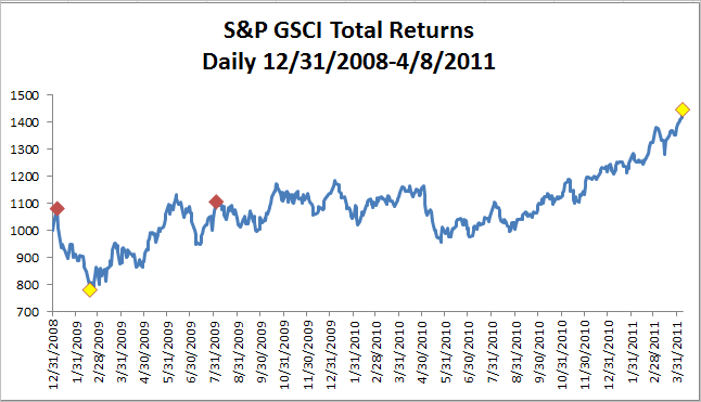
August 3, 2009 ended the last 3-day period the index gained over 10%, up 10.64%. Also in 2009, January 5th ended the largest 3-day gain of 14.31%.  The chart below shows return following these spikes. Notice there was a 26.7% drop from Jan. 5 to Feb.18 of 2009 before a 41.7% gain through Aug. 3 of that year. The S&P GSCI TR continued to increase 30.8% until its peak on April 8, 2011.

Source: S&P Dow Jones Indices. Past performance is not an indication of future results.

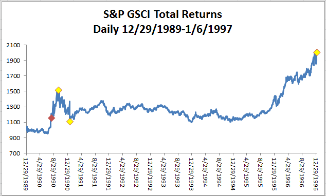
The other two 3-day periods the index gained more than 10% ended on August 6th and 7th in 1990, posting returns of 13.65% and 10.83%, respectively. Notice after this period, the index peaked on Oct. 9, 1990 gaining an additional 25.2% after the historically big 3-day rise. Subsequently it fell 26.8% through Jan. 18, 1991 before rising 80.7% through Jan. 6, 1997.

Source: S&P Dow Jones Indices. Past performance is not an indication of future results.


The posts on this blog are opinions, not advice. Please read our Disclaimers.

Shelter from the Storm

Contributor Image
Chris Bennett

Former Director, Index Investment Strategy

S&P Dow Jones Indices

Like many in the northern hemisphere, the S&P 500® felt a bit blue in January.  With the traditional winter frost came winds of volatility, which, like many of our holiday guests, overstayed their welcome.  On a total return basis, the S&P 500 declined 3% in January, as market volatility from the fall of 2014 lingered into the new year.

All was not lost, however; certain factor-based strategies thrived in the volatility.  The conditions were ideal for defensive strategies, as the markets were both choppy and directionless (since September 2014, the S&P 500 (TR) is essentially flat).  Both high dividend and low volatility strategies have generally provided historical downside protection in volatile markets.

The S&P 500 Low Volatility Index comprises the 100 least-volatile constituents of the S&P 500, while the S&P 500 Dividend Aristocrats® contains the S&P 500 companies that have increased dividends every year for the past 25 consecutive years.  Finance 101 taught us that companies that issue consistent dividends are usually mature, low-growth (read: less volatile) companies.  Therefore, in periods when the S&P 500 performs poorly, we could typically expect both the S&P 500 Low Volatility Index and the S&P 500 Dividend Aristocrats to outperform, as both indices are made up of low volatility stocks.

Capture

The recent bout of market weakness provided an opportunity to test this hypothesis.  While the S&P 500 was flat from September 2014 through January 2015, the S&P 500 Low Volatility Index and the S&P 500 Dividend Aristocrats were up 7.83% and 5.57%, respectively.

Capture

Obviously, these strategies are not perfect downside hedges.  Over the long term, however, both the S&P 500 Dividend Aristocrats and the S&P 500 Low Volatility Index have tended to offer patient investors protection from declining markets, while providing some exposure to the upside.  Though both of these indices tend to underperform the S&P 500 during bull runs, they provide some shelter when the sky starts to fall.

The posts on this blog are opinions, not advice. Please read our Disclaimers.

Asia Fixed Income: China Onshore vs. Offshore

Contributor Image
Michele Leung

Former Director, Fixed Income Indices

S&P Dow Jones Indices

The China offshore renminbi (CNH) bond market has been serving some investors as a gateway to Chinese bonds until the Renminbi Qualified Foreign Institutional Investor (RQFII) program takes off.  The size of offshore renminbi market is approaching CNH 800 billion, yet it is relatively small when compared with the CNY 27 trillion onshore bond market, which is tracked by the S&P China Bond Index.

Fundamentally speaking, the CNH and CNY currencies are different; additionally, onshore and offshore Chinese bonds are subject to different interest rate systems.  While the spreads of the yield curves have converged over time, some spread differences continue—e.g., 3 bps for a 5-Year Chinese government bond and higher for shorter-maturity bonds.

While China’s onshore market is vast, it is predominately restricted to domestic issuers.  On the other hand, many international issuers have tapped into China’s offshore market.  For example, there are quasi names such as the IFC, KFW, and Asian Development Bank, and corporate names like Volkswagen, Total, and Caterpillar.

Perhaps a more significant distinction is that 53% of Chinese offshore corporate bonds (by par amount) are rated by international rating agencies, according to the S&P/DB ORBIT Credit Index.  Of these, a total of CNY 61 trillion in bonds are rated as investment grade by at least one international rating agency (see Exhibit 1 for the index’s rating profile).  Of note, most of China’s onshore bonds are not rated by the international rating agencies.

In terms of total return, the onshore market, tracked by the S&P China Composite Select Bond Index, rose 9.61% in 2014, outperforming the offshore market as represented by the S&P/DB ORBIT Index. Exhibit 2 shows a quick comparison of these two indices of investable bonds.  Last but not least, liquidity and accessibility are definitely the two key criteria to consider when differentiating China’s onshore and offshore bond markets.

Exhibit 1: The Rating Profile of the S&P/DB ORBIT Credit Index

Source: S&P Dow Jones Indices LLC. Data as of Feb. 2, 2015. Charts are provided for illustrative purposes. Calculation is based on the historical monthly returns from December 2009.

Exhibit 2: Comparison of Indices

Source: S&P Dow Jones Indices LLC. Charts and tables are provided for illustrative purposes.

Please click for more information on the S&P China Composite Select Bond Index and the S&P/DB ORBIT Index.


The posts on this blog are opinions, not advice. Please read our Disclaimers.

Freezing Temperatures, Hot Bonds

Contributor Image
Kevin Horan

Former Director, Fixed Income Indices

S&P Dow Jones Indices

The current cold snap that has descended upon the east coast of the U.S. has winter temperatures on par with its neighboring country to the north.  In addition to the weather, the Canadian bond market has seen its share of interest, as on Jan. 21, 2015, the Bank of Canada (BOC) cut rates by 25 bps to an overnight lending level of 0.75%.  The need for the BOC to act was created by sliding inflation, weaker crude prices (which threaten domestic sand oil production), and lagging employment growth.

After the news, Canadian sovereign bonds, as measured by the S&P Canada Sovereign Bond Index, rallied by 0.45%, and this continued into Jan. 23, 2015, with a 0.30% daily total return.  The index closed the month of January at 3.77%, and it has returned 3.86% YTD as of Feb. 2, 2015.  In comparison, the  S&P/BGCantor US Treasury Bond Index has returned 2.00% YTD as of Feb. 2, 2015.

Along with sovereigns, performance of additional segments of the Canadian fixed income market has been just as impressive.  Exhibit 1 shows that over the course of the last year, investment-grade corporates (as measured by the S&P Canada Investment Grade Corporate Bond Index) have tracked sovereigns tightly and recently began to underperform sovereigns.  As of Feb. 2, 2015, the S&P Canada Investment Grade Corporate Bond Index has returned 3.01% YTD.  Since the beginning of the year, the performance for all components of the S&P Canada Aggregate Bond Index has been strong.  The leader of the pack (including sovereigns, provincials and municipals, corporates, and collateralized bonds) has been the S&P Canada Provincial & Municipal Bond Index.  After returning 10.48% in 2014, this segment of the Canadian market has returned 5.83% YTD (as of Feb. 2, 2015).  The combination of yield and a government guarantee has led to significant 2015 performance for securities in this index, with issuers such as Canada Mortgage and Housing, the Province of Quebec, Saskatchewan, British Columbia, and Ontario being some of the top performers.

The laggard of the group is the S&P Canada Collateralized Bond Index, which has returned 1.54% YTD as of Feb. 2, 2015, but the index represents less than 1% of the S&P Canada Aggregate Bond Index.

Exhibit 1: Total Returns of Canadian Bond Indices
Total Returns of Canadian Bond Indices

Source: S&P Dow Jones Indices LLC.  Data as of Feb. 2, 2015.  Charts and tables are provided for illustrative purposes.  Past performance is no guarantee of future results.

The posts on this blog are opinions, not advice. Please read our Disclaimers.

No Alchemy Needed

Contributor Image
Craig Lazzara

Former Managing Director, Index Investment Strategy

S&P Dow Jones Indices

In January 2015, the total return of the S&P 500 Index was -3.0%.  We published this number last Friday evening, after January trading ended, and of course it’s been widely reported since then.  It may therefore surprise you to learn that some investors in the S&P 500 reaped a total return of +4.0% in January.

In this case, there’s no magic needed to turn dross into gold; all the work is done by currency translation.  European investors in the U.S. may have suffered the index’s -3.0% decline, but by holding assets in U.S. dollars rather than in Euros, they avoided the Euro’s -7.0% fall against the dollar.  Translated back to their home currency, they therefore made 4.0% in January.  Similarly, European investors in the S&P TOPIX 150 earned a total return of 9.8% — perhaps surprising their Japanese counterparts, who thought their local market was up by barely 0.2%.  The same effect applies to any pair of relatively strong and relatively weak currencies.  (Last month Canadian investors earned 0.6% in the S&P TSX 60.  Americans who ventured north lost -8.1% as the greenback gained against the loonie.)

Other things equal, if the Euro continues to weaken relative to the dollar, European investors will be more attracted to U.S. investments than they would be otherwise, and similarly U.S. investors will have an incentive not to direct funds to Europe.  Some have therefore argued that “the strong dollar will act like a magnet for global capital.”

Continued currency movements could have that effect.  It’s important to remember, though, that to make this alchemy work, it’s not enough that the dollar be strong.  The dollar must strengthen; changes in exchange rates (and other financial variables) are far more important than the level of those variables.  That said, if the dollar continues to rise, American investors’ home bias will continue to be rewarded, and the U.S. will look increasingly attractive to their European and Canadian counterparts.

The posts on this blog are opinions, not advice. Please read our Disclaimers.