Get Indexology® Blog updates via email.

In This List

How Hell Freezes Over

Impact of the Affordable Healthcare Act on Healthcare Cost Trends

Russian Ruble Rebounds (somewhat)

Playing the Loser's Game

HO HO HO! Merry Christmas

How Hell Freezes Over

Contributor Image
Tim Edwards

Managing Director, Index Investment Strategy

S&P Dow Jones Indices

Between Christmas and New Year, the familiar roar of events turns staccato and the market is gently buffeted by meager trading volumes; the relentless pursuit of profit that agitates the flight of global capital is sedated.  The books are largely closed; the offices of major financial institutions are staffed by fragile acolytes bereft of their titans.  Decisions, if any, are postponed.

Considered contemplation (a luxury denied in more urgent times) is apt.  What more appropriate position of comfort to consider the very nature of crisis?

Crisis, by our understanding of it, should be extraordinary, yet it seems crises are presented to the capital markets ordinarily.  Why (and how) this happens is a deep question, involving not just market structure and probabilities but also human psychology.  A simpler question is to ask what how we might comprehend the alarming frequency with which large movements occur in the equity markets: daily swings of over 10% in benchmarks like the S&P 500 are seven times larger than the average variation – theoretically they should be expected only once in billions of years.1  How then, can they occur so frequently?

The dynamics of volatility are the focus of our latest whitepaper, which explains how dispersion and correlation interact to create crises. One of the interesting features we examined was, in particular, how market volatility reacts to high correlations, and what happens if dispersion moves subsequently. The concepts are fairly simply expressed, and the viewpoint can provide a useful insight into the nature of crisis.

Correlations drive market risk

“The market” is made up of a large number of stocks. Each has its own volatility (which may vary) and each stock correlates to some degree (which may vary) with every other stock in the market. All else being equal, market volatility will be higher if the volatility of the average stock rises and if the average stock-to-stock correlation rises.  The precise relationship can be derived analytically; the table below illustrates the range of market volatility that can result from a reasonable (and historically realistic) range of input variables.

Hell 1

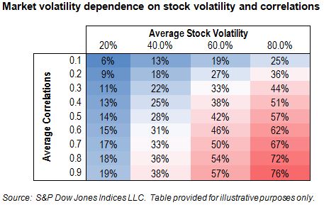
A very wide range of market volatilities is possible and, viewed from this perspective, the importance of correlations is starkly apparent.  In fact, comparing the top left of the table to the bottom right, it seems quite feasible that from one environment to another market volatility might increase by a multiple of over twelve times.  An event that a risk manager might previously dismiss as impossible “because it is twelve standard deviations away from the mean” can suddenly become simply “standard.”

At high correlations, molehills become mountains.

Correlations also help to explain the “flashes” of volatility that occur from time to time.  Stocks themselves encode the risk of the market they inhabit as well as whichever specific day-to-day or structural risks are particular to their business.  The idiosyncratic, non-market risk of each individual stock is clearly particular to that stock.  However, the aggregate level of all such risks among all the stocks in the market is no doubt of interest to risk managers, and in fact it is arguably an important characteristic of the market environment.

The idiosyncratic risks of every stock aggregate to a measure known as dispersion.  Intuitively, one would expect dispersion move in the opposite direction to correlations over time, whereas (as per the table above) one expects market volatility to go up and down together with correlation.  Here is a historical snapshot of each for an extended period in the S&P 500:

Hell 2

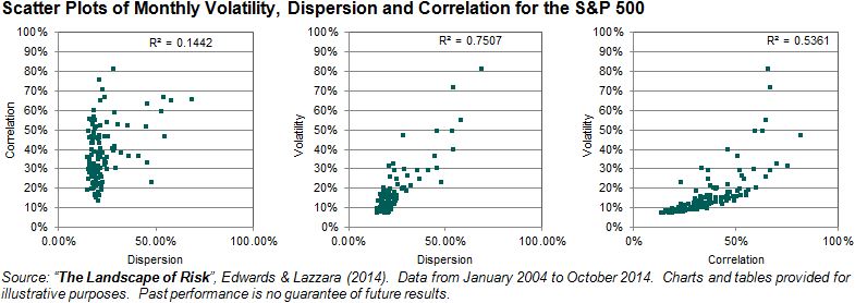
The fascinating, and important, observation to make from the scatter plots is that correlation and dispersion have been remarkably independent.  This has a deeply important consequence.  Other things equal, an increase of either correlation or dispersion will increase volatility.  But at high correlation levels, any subsequent increase in dispersion will generally convert at an elevated multiple into market volatility.  Since dispersion and correlations are somewhat independent, it is quite possible that, even during periods of high correlation, there will be small changes in dispersion – which entail far more dramatic effects in market volatility.  And perhaps this explains why, as the “flash crashes” that followed the financial crisis demonstrated, in periods of high correlation, idiosyncratic events can have systemic consequences.


  1. Calculating such probabilities requires assumptions on how prices move – the most famous of which that price changes roughly follow a Normal (or “Gaussian”) distribution. This distribution is famous for good reason. It turns up all over the place; in fact the theory says that it should turn up most places, eventually. Beginning with Bachelier’s PhD thesis in 1900, through the Black-Scholes’s Nobel-prize winning options formula of 1973 and beyond to the present day, the normal distribution is inextricably linked with the mathematics of finance. Well, more fool us. “Incredibly unlikely” events happen all the time, it’s just that people can have short memories.


The posts on this blog are opinions, not advice. Please read our Disclaimers.

Impact of the Affordable Healthcare Act on Healthcare Cost Trends

Contributor Image
Michael Taggart

Consultant, S&P Healthcare Indices

S&P Dow Jones Indices

With the start of the second annual enrollment under the Affordable Care Act (ACA), there is high interest regarding the impact of the ACA on healthcare cost trends. The S&P Healthcare Claims Indices provide an accurate and up to date source of information available in the market regarding healthcare cost trends. The updates released in October 2014 are a measure for evaluating the impact of the ACA rules on healthcare trends.

The graph below shows the actual 12-month year/year healthcare cost trends for commercial medical insurance plans, with trends shown separately for:

  • ASO (Self Funded) Plans – these plans are typically offered by large employers
  • Insured Group Plans – insurance plans provided by employers with more than 50 employees
  • Individual Plans – medical plans purchased by individuals (including the ACA exchanges)

taggart

A quick glance at the indices makes a couple of issues clear:

  • For most employer-based medical plans, trends reached a low of 3% during late 2011 and have since increased between 4% – 6% annually.
  • For individual plans, healthcare costs began trending upward in early 2011 (while employer costs were trending downward) rising to an annual increase between 6% – 8% by early 2012.
  • With the implementation of the ACA rules eliminating pre-existing conditions, individual medical trends are increasing significantly. The most recent indexes show medical trends at 18% annually and the graph makes clear that the trend may go higher before the market stabilizes.

The S&P Indices highlight a couple of critical realities regarding healthcare costs. First, there is no single “trend rate” of healthcare costs – there are multiple factors impacting healthcare costs and good analysis should provide an understanding of how specific populations and types of healthcare services are changing. Second, healthcare costs can be significantly impacted by public policy changes and it may take years for these changes to be fully evident. In the meantime, having accurate and up to date information about healthcare cost changes will be critical to managing healthcare programs.

The posts on this blog are opinions, not advice. Please read our Disclaimers.

Russian Ruble Rebounds (somewhat)

Contributor Image
David Blitzer

Former Managing Director and Chairman of the Index Committee

S&P Dow Jones Indices

To paraphrase Mark Twain upon reading his own obituary, “Reports of the ruble’s demise have been exaggerated.”   A week ago as the ruble skidded 17% down and briefly traded at almost 80 to the US dollar, commentators were ready to add the ruble to a long list of currencies that cratered in crises. As seen in the chart, the ruble has staged a recovery and now trading at about 55 to the dollar, where it was at the beginning of December.  Oil, the supposed cause of the ruble’s weakness hasn’t staged a similar rebound.

The rebound owes its success to a combination of traditional and novel policy moves and unexpected forbearance by investors.  The initial response from the Russian central bank was to jack up interest rates by 6.5 percentage points to 17%.  This woke everyone up, but didn’t slow the ruble’s slide.  The bank’s second move was to buy rubles in the forex markets – an effort which was successful in stemming the collapse for the moment.  Usually investors greet a currency crisis by pulling their money out as quickly as possible. However,  shares outstanding in one of the largest western ETFs investing in Russian stocks didn’t drop as investors held their ground. One factor encouraging hope for the ruble is the substantial foreign currency reserve position, cited as $400 billion, held by Moscow.

Some novel steps were taken in the last few days. A currency swap agreement between the Peoples Bank of China and the Russian central bank was re-confirmed. This assures additional foreign currency available to support the ruble if needed.  However, further efforts to hold or boost the ruble will probably require more buying of rubles in the forex markets. Recognizing this, the Russian government is telling some state supported corporations to sell their own foreign exchange reserves over the next few months. (link here) Additional efforts urging private sector companies in Russia to sell reserves and buy rubles are expected as well.  The Russian central bank also rescued a local Russian bank facing severe financial difficulties in a move that suggested more confidence on the part of Russian authorities than some expected. Amusingly, the bank is question uses the American movie actor Bruce Willis in its local (Russian) advertising.

The ruble’s rebound and current stability is certainly welcome news to Russia and the Russian government.  However, as Putin indicated in a recent speech, Russia faces a deep recession over the next year or two. Without a rebound in oil prices, it is likely to experience a large fiscal deficit and further economic challenges.  This will mean more pressure on the ruble.  The currency crisis is contained for the time being, but the risk of a deeper economic crisis remains.

The posts on this blog are opinions, not advice. Please read our Disclaimers.

Playing the Loser's Game

Contributor Image
Craig Lazzara

Former Managing Director, Index Investment Strategy

S&P Dow Jones Indices

Forty years ago, Charles Ellis characterized active investment management as a “loser’s game.”  From the perspective of the mid-1970s, Ellis argued that since institutional investors had come to dominate the U.S. equity market, they could no longer generate market-beating returns by taking advantage of less well-informed amateurs.  Investment management had become a game played by professionals against other professionals, and the way to win was to make fewer mistakes than your competitors.  Since Ellis wrote, the trends he identified have continued in force — institutions’ share of assets has grown, portfolio turnover has increased, and managers have become more skillful.

This morning, John Authers of the Financial Times again characterized active management as a loser’s game, this time with special reference to the poor performance of most active managers in 2014.  There are three reasons why 2014 has been so challenging:

  • First, most active managers fail most of the time.  This is a consequence of what Sharpe called “The Arithmetic of Active Management,” and follows from the professionalization of the investment industry.  Since only half of the assets under management can have above-average returns before costs, and since active management costs more than passive indexing, the average active manager is at a disadvantage.
  • Second, there is little evidence of persistence in the success of active managers.  For example, the likelihood of finding a manager who will be above average for four consecutive years is about the same as the likelihood of flipping a coin and getting four heads in a row.
  • Third, active managers were especially challenged in 2014 because of the low level of dispersion in the U.S. equity market.  Dispersion measures the return differential between the average stock and the market index, and is a good proxy for the level of opportunity for active managers.  If dispersion is relatively wide, the opportunities to profit from stock selection are relatively large; when dispersion is narrow, the opportunities diminish.  And 2014’s dispersion may be a record low.

When Ellis wrote in 1975, the alternative to an unsatisfactory active manager was another (putatively-superior) active manager.  Since then, there has been dramatic growth in the availability of indexed investments.  In 2014 more than in most years, an investor who was willing to accept the market’s return outperformed a large majority of active investors.  One way to win the loser’s game is not to play at all.


The posts on this blog are opinions, not advice. Please read our Disclaimers.

HO HO HO! Merry Christmas

Contributor Image
Jodie Gunzberg

Former Managing Director, Head of U.S. Equities

S&P Dow Jones Indices

How would you like some heating oil (HO) for Christmas?  Chances are you wouldn’t really like that too much, especially if you agree with this report posted on Morningstar.com that quotes, “Nobody would ever put oil in their house unless there was no gas on their street.”

Despite the S&P GSCI Heating Oil (spot return) losing 12.7% this month through December 18, it is the only commodity in the energy sector whose excess return of -11.5% is greater than its spot return.  With oil prices falling and heating oil in the index at its lowest since May 2010, how could the roll return (excess return – spot return) possibly be positive, indicating inventory pressure?

According to the International Energy Agency (IEA), saavy consumers are taking the opportunity to stock up on heating oil as prices fall. By October, German end‐user heating oil stocks reached 66% of tank‐fill (+1 percentage point m‐o‐m), their highest level since 2009. The impact is pairing excess return losses this month on heating oil compared to other petroleum constituents including WTI -18.1%, Brent -16.0%, unleaded gasoline -16.4% and gasoil -16.7% in the index.

The difference in roll return or term structures between the S&P GSCI Heating Oil and S&P GSCI Brent Oil has been increasing at an unprecedented rate.  Never in history has this difference increased for five consecutive months. There have been five times in history since 1999 with five consecutive months showing greater excess return in heating oil than Brent oil but not with the acceleration of today that reflects the stockpiling by the heating oil consumer.

Source: S&P Dow Jones Indices LLC. All information presented prior to the index launch date is back-tested. Back-tested performance is not actual performance, but is hypothetical. The back-test calculations are based on the same methodology that was in effect when the index was officially launched. Past performance is not a guarantee of future results.  Please see the Performance Disclosure at http://www.spindices.com/regulatory-affairs-disclaimers/ for more information regarding the inherent limitations associated with back-tested performance.
Source: S&P Dow Jones Indices LLC. All information presented prior to the index launch date is back-tested. Back-tested performance is not actual performance, but is hypothetical. The back-test calculations are based on the same methodology that was in effect when the index was officially launched. Past performance is not a guarantee of future results. Please see the Performance Disclosure at http://www.spindices.com/regulatory-affairs-disclaimers/ for more information regarding the inherent limitations associated with back-tested performance.

The posts on this blog are opinions, not advice. Please read our Disclaimers.