Get Indexology® Blog updates via email.

In This List

Asia Fixed Income: Diversifying into Chinese Bonds

U.S. Preferreds, An Option to Pick A Specialty

Bumpy Roads Ahead in European Equities

The Scary Thing About Falling Oil Prices

No Big Deal

Asia Fixed Income: Diversifying into Chinese Bonds

Contributor Image
Michele Leung

Former Director, Fixed Income Indices

S&P Dow Jones Indices

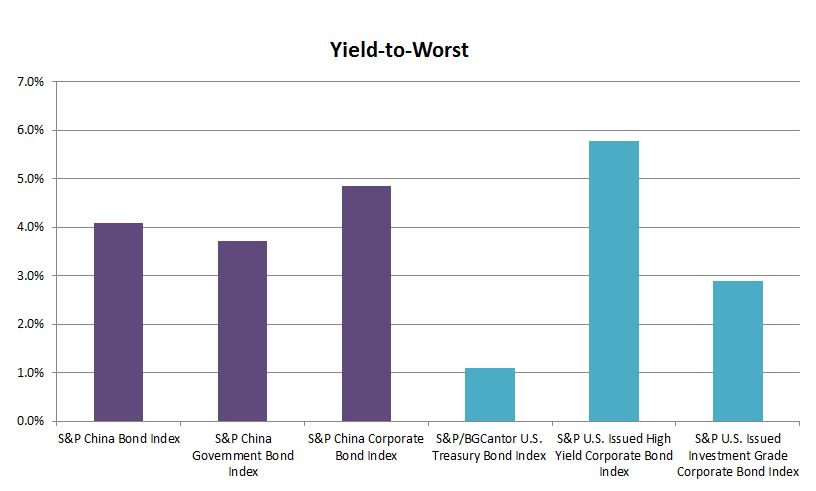
Global investors continue to explore investment opportunities in China onshore bond market. Chinese bonds undeniably offer higher yields than other major bond markets. As of Nov 5, 2014, the yield-to-worst of the S&P China Bond Index stood at 4.09% with a modified duration of 4.15, see Exhibit 1.

Exhibit 1: Yield Comparison

Source: S&P Dow Jones Indices. The S&P China Bond Index, the S&P China Government Bond Index and the S&P China Corporate Bond Index are calculated in CNY. The S&P/BGCantor U.S. Treasury Bond Index, the S&P U.S. Issued High Yield Corporate Bond Index and the S&P U.S. Issued Investment Grade Corporate Bond Index are calculated in USD. Data as of November 5, 2014. Charts are provided for illustrative purposes.

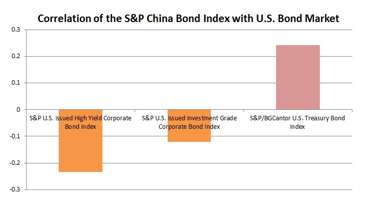
More importantly, investing into Chinese bonds adds diversification benefits to a portfolio through the exposure to local rate, credit and currency. According to the S&P China Bond Index, the Chinese bonds have historically exhibited low to negative correlations to U.S. bonds.

The correlation between the S&P China Government Bond Index and the S&P/BGCantor U.S. Treasury Bond Index, considering monthly returns since Dec, 2006, is 0.25. And if we look at the corporate bond sector, the correlation between the S&P China Corporate Bond Index and the S&P U.S Issued Investment Grade Corporate Bond Index is -0.15, while its correlation with the S&P U.S Issued High Yield Corporate Bond Index is -0.22, see Exhibit 2.

Exhibit 2: Bond Market Correlation

Source: S&P Dow Jones Indices. The S&P China Corporate Bond Index is used to run the correlation with the S&P U.S. Issued High Yield Corporate Bond Index and the S&P U.S. Issued Investment Grade Corporate Bond Index, in orange color. The S&P China Government Bond Index is used to run the correlation with the S&P/BGCantor U.S. Treasury Bond Index, in red color. Correlations are based on the monthly returns since December 29, 2006. Data as of November 4, 2014. Charts are provided for illustrative purposes.

The Chinese bond market has outperformed the U.S. treasury and corporate bond markets year-to-date as well. As of Nov 5, 2014, the S&P China Bond Index delivered a YTD total return of 10.08%.

Want to find out more about the S&P China Bond Index? Please click here.

The posts on this blog are opinions, not advice. Please read our Disclaimers.

U.S. Preferreds, An Option to Pick A Specialty

Contributor Image
Kevin Horan

Former Director, Fixed Income Indices

S&P Dow Jones Indices

Preferred stocks are a class of capital stock that pays dividends at a specified rate and has a preference over common stock in the payment of dividends and the liquidation of assets.

The S&P U.S. Preferred Stock Index is designed to serve the investment community’s need for an investable benchmark representing the U.S. preferred stock market. The Index has currently returned a total return of 0.14% month-to-date and 13.07% year-to-date.

A 13% return in the current low rate environment is fantastic but if you delve a little deeper you can do even better.  S&P Dow Jones Indices has developed sub-indices that break-out the preferred parent index into coupon type and rating sub-indices.

Of the coupon types, the S&P U.S. Floating Rate Preferred Stock Index is outperforming the parent index with a 15.18% year-to-date.  The reason floaters have not pushed the parents return up higher is that floaters only constitute 4% of the overall index.

Rating sub-indices are equally impressive as the S&P U.S. High Yield Preferred Stock Index has returned 0.23% for the month, while the S&P U.S. Investment Grade Preferred Stock Index year-to-date has returned 15.5%.  Depending on your risk tolerance, both rating segments have provided consistent returns though the high yield sub-index has performed better over 3 and 5 year time horizons.
US Preferred Indices Return Performance 20141103

The posts on this blog are opinions, not advice. Please read our Disclaimers.

Bumpy Roads Ahead in European Equities

Contributor Image
Tim Edwards

Managing Director, Index Investment Strategy

S&P Dow Jones Indices

Three things typify systemic equity crises. Firstly, volatility increases. Secondly, correlations rise. And lastly, the stock market falls.

October was a difficult month for European equities. The S&P Europe 350 fell by over 3%, taking a day-to-day lead from Greek government bond prices, and with every sector and nearly every country posting a loss for the month.  A 3% loss is not unusual, nor remarkable. But the warning lights are flashing…

  • 22-day realized volatility in the S&P Europe 350 has nearly tripled since September and is currently registering a level higher than at any point in the last two years:

350 rvol

  • More worryingly, the degree to which stocks move together has risen materially; the correlation among S&P Europe 350 stocks for the month of October was also the highest for over two years. (Indeed, it is close to its highest since 2007)

350 rcor

This may be a flash in the pan – an over-reaction, perhaps, to an underwhelming package of measures unveiled by the ECB in early October, or to economic figures in Germany and France that, while disappointing, were hardly extraordinary. And Japan’s central bank has is coming to the rescue.

However, high correlations and high volatility tend to persist in the short term. And elevated levels of both lead to a highly unstable marketplace.

Don’t be surprised if there are some bigger bumps down the road.

The posts on this blog are opinions, not advice. Please read our Disclaimers.

The Scary Thing About Falling Oil Prices

Contributor Image
Jodie Gunzberg

Former Managing Director, Head of U.S. Equities

S&P Dow Jones Indices

I don’t believe what the gas experts say, “that there is nowhere for gas prices to go but down.”

After another bloodshed month for crude oil as evidenced by the S&P GSCI Crude Oil return of -10.9% in Oct, bringing it down 24.6% off its high on June 20, one might get excited about further savings at the pump. Save that excitement.

The gas retailers are not looking to save any money for anyone but themselves. At least this is the story using data going back to 1991 from the EIA (U.S. Energy Information Administration) for U.S. Regular Conventional Retail Gasoline Prices (Dollars per Gallon) and S&P GSCI Crude Oil levels.

According to the EIA, what we pay at the pump is split into a chart with the following breakdown:

Source: http://www.eia.gov/petroleum/gasdiesel/

This might be true but only on average.  In the total sample of 251 months, gas prices rose during 196 months where oil prices fell.  In only 55 months was the reverse true. Further when oil fell and rose, it was pretty symmetrical, falling on average 6.6% and rising 6.9%; however, when gas prices fell, they only shaved off 3.8% on average compared with an increase of 4.9% when they rose.  The picture becomes even clearer and more biased when observing the gas price change with the oil price change. When oil prices fell, on average gas prices only fell 2.1% but when oil prices rose, gas prices rose 2.7% – in other words, when oil rose and fell, it moved roughly at a 1:1 ratio; but the amount gas rose was 30% more than the fall. If we put this in terms of a beta, or sensitivity, similar to how we calculate a stock beta or inflation beta, the gas beta (to oil) is only 0.41, showing that it doesn’t fully swing up AND DOWN with the underlying oil.

According the IEA (International Energy Agency), it turns out that macroeconomic factors may have a greater impact on (oil) demand than oil prices. Their demand model therefore gives macroeconomic factors a higher weighting than crude oil price assumptions, which do not directly feed‐through to retail product prices, as taxes and subsidies blunt the impact of crude price changes, and are deemed to play a less significant role than economic growth in terms of influencing demand. These two exogenous variables are however, interrelated: lower prices, for most countries, reduce the cost of doing business and support economic growth, the converse being true for net oil exporters. At this point, the only conclusion is that lower prices offer a cushion of sorts against an otherwise vulnerable macroeconomic backdrop.

Source: International Energy Agency Oct 2014.

Gas retailers aren’t the only retailers trying to profit from the everyday consumer like you and me. This is true for food as well. Although grains had a nice rebound in October, with the DJCI Grains gaining 14.5% this month, the DJCI Softs didn’t fare so well and lost 1.6% driven down by all the treats we love like coffee (-2.8%), sugar (-2.5%) and cocoa (-12.2%).  So let’s get excited about cheaper Christmas treats than Halloween treats, right?! WRONG!!!

According to the USDA (U.S. Department of Agriculture,) the farm to table expenses flow much like the pipe to the pump.

USDAfood retail

The USDA also reports, one reason for the relative stability in retail prices in relation to commodity prices is that these prices reflect the cost of processing and marketing inputs in addition to commodity costs. ERS’s 2011 Food Dollar Series reports just 10.8 cents of every food dollar goes toward farm commodities and agribusiness expenses. The remainder is allotted to food processing, food service, and other administrative, transportation, and retailing costs, categories which are less volatile due to fixed machinery expenses, multi-year contracts for supplies, and small year-to-year changes in wages. Since 1990, grocery store wages—which make up over 50% of retailing costs—have increased an average of 2.2% per year.

Moreover, the USDA says retailers and restaurateurs are sometimes slow to pass input costs along to consumers through higher prices, which can cause margins to narrow during times of higher commodity price inflation. Delayed price transmission in grocery stores can occur for a variety of reasons, including re-pricing costs (such as printing new shelf price labels) and concerns that input price changes are only temporary. A 2011 ERS study found that retail prices for bread and beef generally respond to changing commodity prices within 1 to 6 months. However, lags for some foods such as eggs and milk are at the upper end—5 to 6 months.

Notice in the chart below how the All Food CPI (green line) actually rises as the Farm Products PPI (blue line) is falling from Sept to Oct. food lags

Too bad, you might go broke eating the chocolate to fix your depression from the artificially elevated gas price.


The posts on this blog are opinions, not advice. Please read our Disclaimers.

No Big Deal

Contributor Image
Craig Lazzara

Former Managing Director, Index Investment Strategy

S&P Dow Jones Indices

Twenty years from now, some bright young analyst looking at data for the U.S. stock market could be excused for thinking that the S&P 500’s 2.4% total return for October 2014 was no big deal – just one more routine good month in a long bull run.  If the analyst is particularly inquisitive, he might wonder why strategies that we typically regard as defensive outperformed – for example, the S&P 500 Dividend Aristocrats (up 4.4%), or the S&P 500 Low Volatility Index (up 4.9%).  That’s not what we expect to see in an up month like October – and therein lies our tale.

The key, of course, is to remember that October encompassed two radically different market regimes.   Through October 15, the market was in a sharp downdraft, with the S&P 500 falling 5.5%.  This was followed by an even sharper recovery in the last half of the month, as the 500 rallied by 8.4%.

We all learn in elementary finance that volatility can reduce returns.  If you lose 50% and then make 50%, your compound return is -25%; if you lose 10% and then make 10%, your compound loss is only -1%.  Other things equal, lowering volatility can raise returns over time.  October is a fine example of that principle in action:

Defensive Indices Oct 2014

The table shows the performance of the S&P 500 and of three factor or “strategic beta” indices derived from it.  All three of these indices can rightly be considered “defensive,” although they achieve their defensive character in different ways.  The S&P 500 Dividend Aristocrats Index comprises stocks which have increased their dividends for at least 25 consecutive years, and can be thought of as both a yield and quality play.  The S&P 500 Low Volatility Index holds the 100 least volatile stocks in the S&P 500 and tries to exploit the well-known low volatility anomaly.  Dynamic VEQTOR is a multi-asset index which owns both the S&P 500 and a long position in VIX index futures.

What defensive indices have in common is that they aim to offer protection from declining markets and participation in rising markets.  It’s not perfect protection (the Aristocrats and Low Vol both lost money in the first half of October), and it’s not full participation (all three indices lagged the S&P 500 in the last half of the month).  But when the market is choppy, lowering volatility can enhance returns while also lowering risk.

The posts on this blog are opinions, not advice. Please read our Disclaimers.