Get Indexology® Blog updates via email.

In This List

July 31st: More Sellers than Buyers

Late July Muni Minutes

Contributing to the Active vs. Passive Debate: The Grand Launch of the SPIVA® Europe Scorecard

Will the S&P/Case-Shiller Reverse The Trend Or Are Spreads The True Indicator?

Now Your Penny Is Worth More: It's What's On The Inside That Counts

July 31st: More Sellers than Buyers

Contributor Image
David Blitzer

Former Managing Director and Chairman of the Index Committee

S&P Dow Jones Indices

Stocks closed down today with the S&P 500 and the Dow Jones Industrials both down 1.8% despite yesterday’s stronger-than-expected GDP report, numerous earnings reports which beat Street expectations and no hints of early interest rate moves from the Fed.  Bearish or negative news stories weren’t much different from the day or week before – unrest in the Middle East, sanctions on Russia in response to fighting in the Ukraine and an on-going argument between Argentina and a hedge fund over debt.  There was no single event to send the market down for the worst loss in years.

Fear, greed, anxiety and the madness of crowds really do drive markets.  While it is often possible to cite shifts in the economy, corporate earnings or political events for market moves that extend over months or years; short term day-to-day shifts are driven as much or more by emotion than by reason and news. Robert Shiller, the author of Irrational Exuberance, describes surveys of investors down in the days following the 1987 market crash.  Clearly today’s dip is nothing like the 1987 event when the S&P 500 dropped over 20% in a day, but then investors couldn’t point to a news story or major event that sent the market plunging.  The most common news stories cited by investors were about falling stock prices, not some external change in fundamentals or the economy.

Was today’s drop driven by emotion or anxiety with little news or analysis of fundamentals?  The market has drifted in the last few days and closed flat on the best economic news in the last few years. The chart shows a rise in the frequency of searches for the phrase “stock market bubble” on Google Trends and the biggest news story seems to be a lack of action in the Congress.  It will take several weeks or months to see if today’s drop was caused by more worried people selling than confident people buying.  Unless news and the fundamentals turn much worse the best explanation may be simply worried investors.

Period Shown 11/2013 to 7/2014

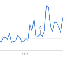
Google Trends shows the relative frequency of searches for specific terms.  The letter A indicates the publication of an article in Forbes on Where to Invest When the Market Bubble Bursts.

The posts on this blog are opinions, not advice. Please read our Disclaimers.

Late July Muni Minutes

Contributor Image
Tyler Cling

Senior Manager, Fixed Income Indices

S&P Dow Jones Indices

Long-term bonds have posted solid gains thus far in 2014, with rates holding low longer than most expected. The composition of the municipal bond market is heavily weighted with short duration bonds. The looming sentiment of rising rates and inflation has investors focused on reinvestment risk; however, a supply imbalance systemic of voters’ hindrance for governments to take on additional debt has municipals as a whole outperforming their peers. This is demonstrated in the S&P Municipal Bond 20-Year High Grade Index which has a YTD return of 14.29% due to low rates & short supply.

Capture

In a year of record corporate bond issuance from low cost/easily available financing in an environment where investors are looking anywhere for high-yield returns, corporates are under performing. The S&P U.S. Issued High Yield Corporate Bond Index has a YTD return of 5.05% compared to the S&P Municipal Bond High Yield Index which is 9.23%. The raw yield statistics can be misleading when considering tax implications, where the S&P Municipal Bond High Yield Index has a tax equivalent yield of 9.86%, far superior to its corporate bond counterpart of 5.26%.

The heavily short-term weighted muni market is showcased in the broad market S&P Municipal Bond Index, which tracks over 75,000 bonds. The S&P Municipal Bond Index has a modified duration of 4.84 compared to 12.08 as seen in the S&P Municipal Bond 20-Year High Grade Index. Duration asserts not only the timeliness of cash flow repayment, but also the price volatility to interest rate changes. While the market prepares itself for rate inflation, those positioned for stagnant rates (long duration) have been benefiting.

Capture

Generally, all munis are surpassing analysts’ expectations in 2014, however, not all munis are created equal. High performing Tobacco bonds are up 11.26% YTD which can be seen in the S&P Municipal Bond Tobacco Index, whereas Puerto Rico bonds in the S&P Municipal Bond Puerto Rico Index continue to underperform at 4.37% YTD.

For a look into this week’s economic indicators, please refer to my colleague Kevin Horan’s recent post.

The posts on this blog are opinions, not advice. Please read our Disclaimers.

Contributing to the Active vs. Passive Debate: The Grand Launch of the SPIVA® Europe Scorecard

Contributor Image
Daniel Ung

Former Director

Global Research & Design

Following the success of the SPIVA publications in the U.S. and elsewhere, we have decided to launch a similar publication for Europe to shed some light on the ongoing active vs. passive debate.  Similar to the publications in other regions, SPIVA Europe will be published twice a year; mid-year and at the end of the year.

Let’s have a look at the results of the past year.

Euro-Denominated Equity Funds
The past year saw a strong rebound of the European equity markets, as measured by the S&P Europe 350®, which posted an impressive 21% gain.  Over 1-year, 3-years and 5-years, most actively managed funds invested in European and Eurozone equities underperformed. This was equally true for both global equities and emerging market equities, which would have been expected to outperform their respective benchmarks in conditions of heightened volatility and wide return dispersion.

GBP-Denominated Equity Funds
The significant majority of the U.K. and European actively managed equities funds have posted better returns than the benchmark.  This success was not repeated when it came to international funds, emerging market funds and U.S. funds, over the short-term and the long-term.

The posts on this blog are opinions, not advice. Please read our Disclaimers.

Will the S&P/Case-Shiller Reverse The Trend Or Are Spreads The True Indicator?

Contributor Image
Kevin Horan

Former Director, Fixed Income Indices

S&P Dow Jones Indices

Today’s Pending Home Sales for June month-over-month came in lower than the expected 0.5% at a -1.1%.  The prior May number was a 6.1% later revised to a 6.0%.  Tomorrow the S&P/Case-Shiller 20-City Composite Home Price Index is due for release at 9am.

Heading into the release, the spread of the S&P/ISDA CDS U.S. Homebuilders Select 10 Index is at 155.7, steadily increasing the cost of insurance throughout the month after an initial step down the first week.  Year-to-date the cost of homebuilders insurance topped out at a spread of 178.05 on April 23rd.  The spread touched a bottom point of 136.6 at the beginning of July, 11 basis points tighter than the December 31st value of 147.58.  At 155.7 the cost of insurance would be $1,557,000 per million of coverage.

Spreads of the homebuilder issuers, of which the majority reside in the S&P U.S. Issued High Yield Corporate Bond Index due to the nature of the business and their credit worthiness, have widened on average over the course of July by 19 basis.  M/I Homes Inc. widened the most in option adjusted spread (OAS) by an average of 181 basis points, followed by Shea Homes LP.,at 105.

Kris Hudson of the Wall Street Journal recently wrote an article entitled: Some Home Builders Say First-Time Buyers Returning, Other Not Sure, which covers the indecisiveness of whether buyers, especially first time buyers, are returning to the housing market.

Source: S&P Dow Jones Indices, data as of 7/25/2014

The posts on this blog are opinions, not advice. Please read our Disclaimers.

Now Your Penny Is Worth More: It's What's On The Inside That Counts

Contributor Image
Jodie Gunzberg

Former Managing Director, Head of U.S. Equities

S&P Dow Jones Indices

Do you know what is inside that seemingly copper penny? It may be more valuable than you think. I’ll give you a hint: It rhymes with think.

Inside the industrial metals, we usually speak of copper and aluminum, especially in the context of the spread trade where it seems aluminum is perpetually more abundant than copper. Also, copper has a reputation, though not well-deserved in my opinion, of predicting the health of the economy, earning a nickname of “Dr. Copper.”

However, this year, nickel has taken center stage as the new gold for 2014 as Indonesia bans exports in an effort to grow its domestic stainless steel industry. It is unusual to see nickel in the spotlight given most people are unaware of its common applications, but the YTD return of almost 40% is hard to ignore. ZInc is not unlike nickel in that its main use is as an alloy, used mostly to strengthen the stars of the show.

Did you know Zinc is the primary metal used in making American pennies? 97.5% of every penny made since 1982 is zinc. Zinc is found almost everywhere in daily life: in every cell of the human body, in the earth, in the food we eat and in products we use such as sunblock, cosmetics, automobiles, airplanes, appliances, batteries, musical instruments, surgical tools and zinc lozenges. Further, zinc is the third most used nonferrous metal (after aluminum and copper), of which the U.S. consumes more than one million metric tons annually; the average person will use 730 pounds of zinc in his or her lifetime, according to the U.S. Bureau of Mines.

In the DJCI and S&P GSCI, zinc is weighted just like the alloy it is, about 2% in DJCI and less than 1% in S&P GSCI. However, it is now becoming noticeable for its returns. For the first time since 2005-06, there are two consecutive months where the total returns are greater than 7.5% in each month – June and July through the 25th. The S&P GSCI Zinc index levels are now at the highest in 3 years.

Source: S&P Dow Jones Indices. Data from Jan 1991 to July 2014. Past performance is not an indication of future results.

Zinc is the best performer in the indices in July MTD, bringing its YTD performance to 14.8%, which is strong but not a standout in a year like 2014.  Generally low inventories coupled with recent strong Chinese industrial demand growth is driving the price increase. Data from last Monday showed China’s zinc imports rose 123.55% in June year on year to 68,475 tonnes. Also, zinc prices have been driven higher this year by a paucity of big mine projects just as existing mines such as Century in Australia dry up.

The posts on this blog are opinions, not advice. Please read our Disclaimers.