Get Indexology® Blog updates via email.

In This List

A Bang not a Whimper

Some Inconvenient Truths

How Smart Is Dr. Copper?

The Price of Risk: Market Readies for $3billion Puerto Rico Junk Bond Sale

Deflation, Debt and Disaster

A Bang not a Whimper

Contributor Image
David Blitzer

Former Managing Director and Chairman of the Index Committee

S&P Dow Jones Indices

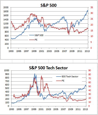
Whenever this bull market ends, it is likely to be with a bang, not a whimper. The bull market began on March 9th, 2009, five years ago.  The last bull market lasted exactly five years from October 2002 to October 2007; the one before that – the great tech boom – lasted 10 years. This bull market isn’t that old. Aside from the passage of time, the next concern people raise is valuation – are stock prices “too high?”  While valuations, measured by price-earnings ratios, are above long run averages, they are modest or almost reasonable compared to the technology boom of the 1990s. Moreover, the S&P 500 is not concentrated in a few stocks or one sector. Technology is closer to a fifth of the index value today than the third it was at the end of the 1990s. The index itself is not that concentrated either: the largest stock is less than 3% of the total market value.

In keeping with the title, guessing the end of the bear market probably means guessing the next economic, political or financial upheaval.  The situation in the Ukraine is not likely to end the bull market unless the US becomes involved in military action – an extremely remote possibility.  A more likely scenario that might send the market lower would be large default of one or more junk bond issues.  The long period of low interest rates has made people more adventurous with credit risk.  Equity investors, especially after the bear markets in 2002 and 2007, should recognize that stocks can nose dive; bond investors would need memories extending back to the 1970s to understand some of the dangers.  We seem to be nervously safe for the moment.

The charts show how the S&P 500, the Dow and the tech sector in the 500 have developed since 1993. The blue line is the index; the red is the PE ratio.

Source: S&P Dow Jones Indices and Blooomberg

The posts on this blog are opinions, not advice. Please read our Disclaimers.

Some Inconvenient Truths

Contributor Image
Craig Lazzara

Former Managing Director, Index Investment Strategy

S&P Dow Jones Indices

Today’s Wall Street Journal brought the latest in a string of articles suggesting that we have entered a period of particular opportunity for active investment management — a so-called “stock-picker’s market.”  Because the average correlation of stocks within the S&P 500 or other major indices has declined, it’s argued, “active managers are going to do better” as the “cream rises to the top.”

Or maybe not.  The argument in favor of active management in 2014 has to contend with at least three inconvenient truths.

First, the average cannot be above average.  If all asset owners own all the assets there are to be owned, the average asset owner will earn the return of the average asset (i.e., the market return).  If we array the asset owners in rows and the assets they own in columns, the sum of the rows must equal the sum of the columns, and the sum of the changes in the rows must equal the sum of the changes in the columns — so the average return across the rows equals the average return down the columns.  William Sharpe called this “The Arithmetic of Active Management” more than 20 years ago, and the laws of arithmetic still hold.

Of course, there can still be periods when the average institutional manager outperforms a market index — but they occur only when the rows and the columns don’t match.  For example, if individual investors control 80% of the assets, and institutions control 20%, it’s entirely possible for most of the institutions to do better than the market average.  (This may be a fair description of the 1950s and 1960s.)  If a market index doesn’t describe the managers’ entire opportunity set, it’s also possible for the average manager to outperform — perhaps by buying small- and mid-cap stocks while being compared to a large-cap benchmark.

But if the index is sufficiently comprehensive, and the census of all investors is sufficiently accurate — the inexorable arithmetic of active management will hold.  Empirical studies have amply verified the theoretical argument.

Second, correlation is primarily a measure of timing, not of investment opportunity.  Assets which are positively correlated go up and down at the same time; negatively correlated assets move in opposite directions.  It’s not hard to put together an example of two stocks with perfectly negative correlation but with identical returns over the course of a month.  An omniscient day trader would benefit from trading these stocks.  For the rest of us, the benefits are less clear.  The fact that correlations declined in 2013 means that (other things equal) the market will be less volatile in 2014.  It does not mean that active manager performance will improve — the average is still average.

Finally, dispersion — which is a measure of investment opportunity — remains low. Unlike correlation, which measures whether assets go up and down at the same time, dispersion reflects the degree of difference between the best and the worst performers.  In a high dispersion environment, there’s a large gap between the “best” stocks and the “worst” stocks; when dispersion is low, the gap is small.  In 2013, dispersion in the U.S. market — despite falling correlations — was at its all-time low:

Ave monthly dispersion S&P 500Although dispersion ticked up modestly at the beginning of 2014, it’s still well below its historical average level.  This doesn’t mean that a skillful (or lucky) manager will be less skillful (or lucky) than he would otherwise be.  Dispersion says nothing about the level of a manager’s skill, but it signifies something important about the value of that manager’s skill.  The fact that today’s dispersion levels are quite low implies that the rewards to successful stock picking are likely to be small by historical standards.

Which does not sound like a “stock-picker’s market” to me.


The posts on this blog are opinions, not advice. Please read our Disclaimers.

How Smart Is Dr. Copper?

Contributor Image
Jodie Gunzberg

Former Managing Director, Head of U.S. Equities

S&P Dow Jones Indices

Copper is reputed to have earned a Ph.D. in economics because of its ability to predict turning points in the global economy.  This is since copper is so broadly used across industries from building construction, machinery, power generation and transmission, electronic product manufacturing and in transportation vehicles. As the demand for copper rises, its price likely increases and suggests a growing global economy. Conversely, declining copper prices may indicate sluggish demand and an imminent economic slowdown.

Given the recent drop in the S&P GSCI Copper, down 3.7% on Friday March 7, bringing the YTD loss to 7.5%, might that be an indicator of China’s slowing economy?  It has been shown that (lagged) copper has a correlation of roughly 0.4 with world GDP growth, which can be considered moderate at best. Further, while copper returns appear highest in the strong expansion phase and lowest in the strong recession phase, what is interesting is that returns seem to hold up quite well during periods of weak recession. Please see the chart below from my colleague, Daniel Ung, published in this paper on the S&P GSCI Cash Copper.

Source: Bloomberg, Thomson Datastream, S&P Dow Jones Indices, Data from March 1987 to April 2012. Calculations are based on LME cash copper  prices.
Source: Bloomberg, Thomson Datastream, S&P Dow Jones Indices, Data from March 1987 to April 2012. Calculations are based on LME cash copper prices.

Further, below is a chart of yoy% GDP growth from the U.S., China and the U.K. with the S&P GSCI Copper lagged one year, which again shows some relationship but not a super compelling case that copper should earn a Ph.D. from predicting turning points in the economic cycle.

Source: S&P Dow Jones Indices and Bloomberg. Data from  1978 to 2013. Past performance is not an indication of future results. This chart reflects hypothetical historical performance. Please note that any information prior to the launch of the index is considered hypothetical historical performance (backtesting).  Backtested performance is not actual performance and there are a number of inherent limitations associated with backtested performance, including the fact that backtested calculations are generally prepared with the benefit of hindsight.
Source: S&P Dow Jones Indices and Bloomberg. Data from 1978 to 2013. Past performance is not an indication of future results. This chart reflects hypothetical historical performance. Please note that any information prior to the launch of the index is considered hypothetical historical performance (backtesting). Backtested performance is not actual performance and there are a number of inherent limitations associated with backtested performance, including the fact that backtested calculations are generally prepared with the benefit of hindsight.

Unfortunately, the idea that the of the economy can be predicted by the demand reflected in the price of copper, is not the full picture of health. The supply side of the price equation is just as important and economic theory dictates that demand strength does not automatically translate into price hikes. Instead, it is the lack of an adequate supply response coupled with a rise in demand for supply-inelastic products, such as copper, that results in price inflation. It follows from this, that in many ways, supply is arguably more important than demand in explaining the recent behavior of the copper market.

This assertion is borne out by statistics. Over the last decade, according to World Bureau of Metal Statistics (2012), primary mine production grew by a meager 1.8% per year compared to demand, which rose by 2.4%. The copper market was in supply deficit for seven years in the last decade.

Below is a chart of the S&P GSCI Copper versus the roll yield, which is a measure of the term structure indicating a shortage or backwardation with a positive return and an excess or contango with a negative return.  Why it is more interesting than the chart above that shows copper versus GDP, is that it shows the the relationship of copper to its inventory situation. Copper was one of the few commodities with strong shortages prior to the financial crisis, but eventually the demand decline was too strong for the shortage to have an impact. Eventually the inventories caught up to and surpassed the demand as suppliers had rushed to bring more copper to the market. By the time the worst of the crisis passed, there was significant contango or excess inventory despite the rise in copper price.

Source: S&P Dow Jones Indices. Data from Jan 2004 to March 2014. Past performance is not an indication of future results. This chart reflects hypothetical historical performance. Please note that any information prior to the launch of the index is considered hypothetical historical performance (backtesting).  Backtested performance is not actual performance and there are a number of inherent limitations associated with backtested performance, including the fact that backtested calculations are generally prepared with the benefit of hindsight.
ge  Source: S&P Dow Jones Indices. Data from Jan 2004 to March 2014. Past performance is not an indication of future results. This chart reflects hypothetical historical performance. Please note that any information prior to the launch of the index is considered hypothetical historical performance (backtesting). Backtested performance is not actual performance and there are a number of inherent limitations associated with backtested performance, including the fact that backtested calculations are generally prepared with the benefit of hindsight.

However, unlike stocks that recovered well after their dip in 2011, copper can’t seem to comeback.

Source: S&P Dow Jones Indices. Data from Jan 2004 to March 2014. Past performance is not an indication of future results. This chart reflects hypothetical historical performance. Please note that any information prior to the launch of the index is considered hypothetical historical performance (backtesting).  Backtested performance is not actual performance and there are a number of inherent limitations associated with backtested performance, including the fact that backtested calculations are generally prepared with the benefit of hindsight.
Source: S&P Dow Jones Indices. Data from Jan 2004 to March 2014. Past performance is not an indication of future results. This chart reflects hypothetical historical performance. Please note that any information prior to the launch of the index is considered hypothetical historical performance (backtesting). Backtested performance is not actual performance and there are a number of inherent limitations associated with backtested performance, including the fact that backtested calculations are generally prepared with the benefit of hindsight.

This might change though despite the reports of worries about the Chinese economy in light of the first default on a bond from a company traded in mainland China, and also after the official manufacturing PMI in Feb fell to an eight-month low of 50.2, just above the 50 level that separates contraction from expansion.

China accounts for 40% of global copper consumption, and even a small drop in demand could leave the market awash in extra metal.  However, given there has been a shortage (as shown by the roll yield) for 4 months straight now, it is possible copper could rebound.

As I have mentioned in prior notes, there are great opportunities for individual commodities now from the shortages that create low correlations across the spectrum.  It may or may not be time for copper but what is certain is that its supply shocks differ from the current shocks of agriculture and energy.


The posts on this blog are opinions, not advice. Please read our Disclaimers.

The Price of Risk: Market Readies for $3billion Puerto Rico Junk Bond Sale

Contributor Image
J.R. Rieger

Former Head of Fixed Income Indices

S&P Dow Jones Indices

Puerto Rico general obligation bonds tracked in the S&P Municipal Bond Puerto Rico General Obligation Index have rallied 13.67% this year ahead of the planned $3 billion bond sale by Puerto Rico this coming Tuesday.  Yields of bonds in the index have dropped 122bps to end March 7th 2014 at 7.12%.  The success of the pending bond sale and the yields investors are willing to accept in return for the taking on the risk of lending their money to Puerto Rico will be very telling. This is Puerto Rico’s first new bond issue since it was down graded by all three ratings agencies to below investment grade last month.

On the eve of such a large sale of bonds a few things are going in Puerto Rico’s favor.  The municipal bond market has absorbed large bond issues in the past.  The triple tax-exemption on the interest earned on most bonds issued by Puerto Rico has, in the past, added to their value proposition. This deal is designed for institutional investors and those investors have been demonstrating they are willing to take on risky assets paying higher yields. Yield remains a powerful driver for investors. Average yields of these bonds have peaked at over 8% during the last two months which has attracted the attention of these yield hungry investors.

The last several weeks have illustrated the extent of that demand as yields for Puerto Rico G.O.’s have finally come back below the yields of CCC and below corporate bonds.

The graph below charts yield to worst of bonds in the S&P Municipal Bond Puerto Rico General Obligation Index vs. the yield to worst of bonds in the S&P U.S. Issued CCC & Lower High Yield Corporate Bond Index.

Source:  S&P Dow Jones Indices LLC.  Data as of March 7, 2014.

Source: S&P Dow Jones Indices LLC. Data as of March 7, 2014.

The recent steep decline in yields have pushed bond prices up resulting in Puerto Rico out performing the rest of the municipal bond market and other bond market segments so far this year. This new issue will tell us a lot about the depth of the market along with what price investors are willing to pay for the risk.

The table below highlights select fixed income asset classes and their year-to-date performance.

Source: S&P Dow Jones Indices LLC.  Data as of March 7, 2014.

Source: S&P Dow Jones Indices LLC. Data as of March 7, 2014.

The posts on this blog are opinions, not advice. Please read our Disclaimers.

Deflation, Debt and Disaster

Contributor Image
David Blitzer

Former Managing Director and Chairman of the Index Committee

S&P Dow Jones Indices

Central Banks persist in fighting inflation. The Fed is tapering and talking about tighter money. The European Central Bank won’t cut interest rates. Only in Japan, where the Prime Minister is pushing the Bank of Japan is there a hint of a different approach.

Inflation rates in most developed markets are below central bank targets of 2%.   In the US the Personal Consumption Expenditures deflator – the Fed’s preferred measure – puts inflation at 0.9% over the four quarters of 2013.  The Eurozone consumer price index is a touch lower at 0.8% for the year ended in February.  Japan is the surprise leader with consumer prices up 1.1% after spending 2-1/2 years in negative territory.  All this raises two questions: what is so bad about deflation and why aren’t central banks doing something?

Deflation is falling prices – not just gasoline at $4 a gallon or the cost of health insurance – almost every price falls.  Deflation leads to stagnant economies and depression.  The problem is the prices that don’t fall.  In most economies wages and salaries rarely adjust downward.  Whether by convention, union contracts or competition for workers, wages are sticky.  As prices fall, employers face rising real (inflation adjusted) labor costs. One reason why job growth is still weak five years after the recession and many new jobs offer very low wages is that with inflation almost zero, the relative cost of labor is higher than it used to be.   The second problem is debt.  With deflation  the real value of debt rises, paying off debt becomes harder and defaults multiply.   The housing crisis was a limited example – home prices fell, incomes were stagnant and mortgage defaults rose. When the amount of money and credit in the economy collapse, prices and economic activity collapse.  That was the fall of 2008.  Despite the Fed’s timely response to pump  money and credit into the economy, we are still on the edge of deflation today.

Central banks could be more aggressive about deflation, but are more concerned with far distant future inflation.  Economic policy is, hopefully, based on good economic analysis; it is also based on primal fears and (re)fighting the last war. The first hand history of monetary policy in the US that economists and bankers can personally recall goes like this: 1970s saw rampant double digit inflation, Paul Volcker saved the economy and the Fed by ending inflation with a deep recession, setting the stage for two decades of economic growth and all was fine until home price inflation spooked the Fed and led to the financial crisis. The last war was the end of inflation in 1979-82.  Forgetting that lesson would a terrible thing.

In Europe the primal fear is Germany’s hyperinflation in the 1920s lead to Depression and the Second World War. For sixty years Europe was committed to preventing another inflation – either successfully in Germany or with frustration in other countries. This is why the Bundesbank, Germany’s pre-euro central bank, is held up as the model for the current European Central Bank.

Muddling along on the edge of deflation leaves the economy with more risk of collapse and too little growth.  The answer is not for the Fed to stop tapering and introduce QE4.  A better approach is fiscal policy – both spending and tax reform. The economy can afford some fiscal stimulus, especially to rebuild basic infrastructure like roads, bridges and airports.

The posts on this blog are opinions, not advice. Please read our Disclaimers.