MIT’s Technology Review pitches an argument by Richard N Foster, well known consultant, which uses exits from the S&P 500 to show that companies suffer shorter lifespans these days and are dropping off indices faster than they used to. Foster includes a chart showing a seven year moving average of corporate lifespans including a forecast beyond the year 2025. He blames the increasing pace of technology and the need for rapid innovation for the losses.
Changes to the S&P 500, the Dow and other indices report shifts in the corporate world and rather than causing them. However, there is more going on here than the speed of innovation and technology. About two-thirds of all exits from the S&P 500 are caused by M&A; and, more often than not, both the acquirer and the target are in the S&P 500. When a company is acquired, it may drop off the index but its activities, products, revenues and (hopefully) profits remain – and stay in the index if the acquirer is in the index. Sometimes a company is acquired specifically because it has great technology. The better measure of lifespan might be to look at the handful of companies that leave the S&P 500 because they have shrunken or filed for bankruptcy. Any measure of corporate senility must be balanced against the list of companies that have been in the S&P 500 since it became 500 stocks in 1957 or since it began as a 90 stock index in 1926. There are some long lived entities still going strong.
The posts on this blog are opinions, not advice. Please read our Disclaimers.


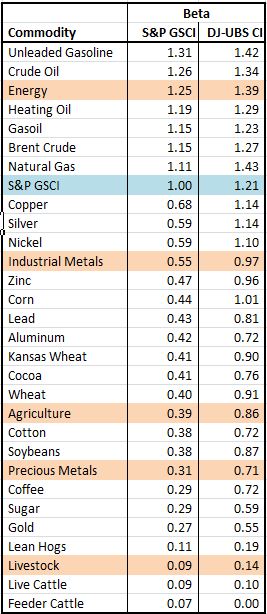
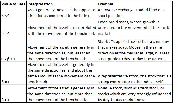 http://en.wikipedia.org/wiki/Beta_(finance)